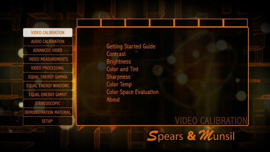
Video Calibration
Thank you for purchasing the Spears and Munsil HD Benchmark, Second Edition! We believe this is the most comprehensive and accurate suite of video and audio tests available, and we hope you will find it to be a valuable addition to your video library.
The Video Calibration section of this disc contains just the core patterns needed to do the most common calibration operations on a consumer display. Using these patterns, you can:
• Set the main picture controls: Contrast, Brightness, Color, Tint, and Sharpness
• Choose the appropriate color space
• Correct issues with clipping of highlights
• Choose an appropriate color temperature mode
Each of the patterns on this disc has a help section that can be brought up by pressing the Up button on your Blu-ray Disc player remote. You can also move to the next or previous pattern using the Left and Right buttons on your Blu-Ray Disc player remote; you do not need to exit back to the menu to change patterns.
If you have some experience using video calibration discs, you will probably find that you can use these patterns to do a quick set of adjustments by just selecting each pattern in order, optionally reading the help text, and making adjustments to the display and/or player controls.
If you are new to calibration, or would like to perform a more detailed and in-depth set of adjustments, a complete guide to doing a basic calibration is available on the Spears and Munsil web site: https://spearsandmunsil.com, in the Articles section. The article is called “Getting Started with the High Definition Benchmark.” Allow 30-60 minutes for a complete adjustment, or longer if you are new to video adjustment. We recommend printing the article so you can refer to it while you are calibrating, and have pen and paper available for making notes.
While you are visiting our web site, you might find it interesting to read some of our other articles going into more detail about the history of video and the technical underpinnings of video calibration. If you have any questions or comments, please email us at [email protected].
Contrast
This pattern is designed for setting peak level using the Contrast control.
The goal is to get Contrast set as high as possible without clipping the brightest whites and colors. All of the numbered white bars should be visible and distinct from the surrounding background, though the top two or three may be difficult to distinguish from the background unless you are in a dark room with your eyes fully adjusted to the ambient level. The colored squares at the top and bottom should have small darker squares in the center of each. The ramp in the center that goes from black to white and back should have a very thin white stripe in the center, but no other streaks or bands.
To use this pattern, turn up Contrast until you see one of more of the clipping or banding artifacts mentioned above, then turn it down until the artifacts disappear.
Brightness
This pattern is designed for setting black level using the Brightness control.
First turn up Brightness until all four bars are visible. Then turn Brightness down until the left two bars disappear and the right two bars are still barely visible. If you cannot see the left two bars even if you turn up Brightness all the way, turn down Brightness until the second bar from the right disappears and the far right bar is barely visible, then raise Brightness one notch.
After setting Brightness, you should return to Contrast to make sure that it is set properly, because on many displays the Brightness and Contrast controls affect each other. Move back and forth between the Brightness and Contrast patterns and readjust until both patterns look correct. Then move on to Color and Tint.
Color and Tint
This pattern is designed for setting the Color and Tint controls. (Note that Color might be called “Saturation” and Tint might be called “Hue” on some displays.)
If your display has a “blue only” mode, use that. Otherwise use the Spears & Munsil blue filter. Look through the 1x side of the filter. If the left bars do not blend completely with the background, switch to the 2x side of the filter. If the left bars still do not disappear fold the filter in half to make a 3x filter.
Looking through the appropriate-strength filter, adjust Color so the blue and white boxes match. Adjust Tint so the magenta and cyan boxes match. You may need to go back and forth between the two controls to get both sets of boxes to match.
Sharpness
This pattern is used to set the Sharpness control.
This control should be set while seated in the normal viewing location. In general, you would like Sharpness to be set to the highest level that doesn’t produce distracting visual artifacts. When Sharpness is correct, you should not see ripples near any of the lines in the image. The vertical and horizontal lines should have clean, sharp edges with no ghost lines or bright halos next to them. The circles and diagonal lines should be smooth and free of stairstepping. The fine patterns on the top, bottom, left, and right edges of the screen should largely blend in with the background.
Start by turning up the Sharpness control until you start to see one or more of the artifacts listed above, then turn it down until the artifacts just barely disappear.
Color Temp
This pattern is used to choose a basic Color Temperature mode, for displays that have selectable color temperature.
Without special test equipment, it is impossible to set this perfectly, but it is possible to avoid obviously incorrect settings. The goal is to get the pattern to look like neutral white and gray with no obvious color tint. Color temperatures that are too low will look yellow or orange tinted, and color temperatures that are too high will look blue tinted. If your display has a “D65” or “6500K” setting, that’s likely to be the best choice.
If you have a 6500 degree “natural light” lamp and an 18% gray card, you can light the card with the lamp in an otherwise dark room and choose a color temperature that matches it as closely as you can. Otherwise just choose the most neutral white available.
Color Space Evaluation
This pattern is used to choose the most appropriate output color space from your Blu-ray Disc player and/or video processor.
Color spaces can include 4:2:2 YCbCr, 4:4:4 YCbCr, 4:4:4 RGB, and possibly others. While viewing this pattern, select in turn the different color spaces, watching for problems.
• The colored gradients should be smooth and free of bands or streaks.
• The colored lines should all be visible, bright, and clear, with no stairstepping or fading.
• The thin colored lines in the center section should be centered within the tall thin diamond shapes.
• You should see a small green square in the middle of the green square labeled “709” and no red square in the middle of the red square labeled “601”.
• You should be able to see all small squares in each of the six boxes at the top center of the screen and the three boxes at the bottom center of the screen.
Choose the color space that has fewest problems. If all spaces are equivalent choose 4:2:2 YCbCr.
Audio Calibration
This section of the disc contains test signals to assist in setting up and calibrating your home theater receiver and speakers. Using these tests and an Sound Pressure Level (SPL) meter, available from many electronics stores and online vendors, you can:
• Ensure your speakers are connected to the correct channels on your receiver
• Set the correct relative levels of all the speakers, and optionally a reference main level for your receiver.
• Ensure that all your speakers are connected with the same polarity.
• Ensure that the audio delay on your receiver is correct and the audio and video are in sync.
With the Levels and Polarity tests, the help text is on the screen all the time and does not need to be brought up using the Up arrow on the Blu-ray Disc player remote. The A/V Sync tests have the usual help text that can be brought up with the Up arrow.
Before running these tests, you should go to the Settings menu at the bottom of the main menu and set whether you have a 7.1 or 5.1 speaker system, and optionally select your preferred audio codec, or run the test with both codecs to ensure that the system is properly calibrated for both.
If you need an SPL meter, there are many reasonably-priced units available on Amazon.com. Just search “SPL Meter” to see their selection. Electronics stores such as Radio Shack will usually carry at least one type. It is not necessary to buy an expensive or fancy meter for doing speaker matching; a simple model will work fine.
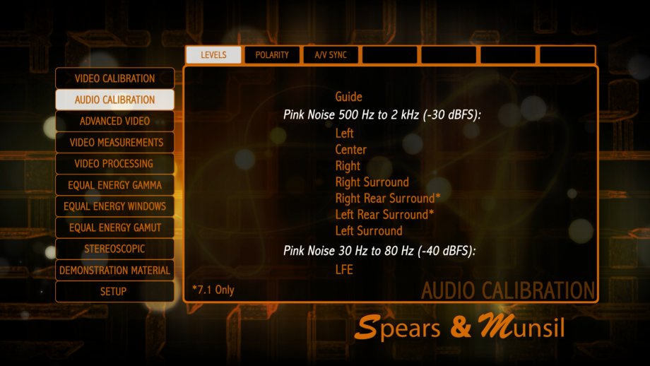
Levels
Pink noise is playing from a single speaker to allow you to check correct speaker hookup and to calibrate volume level. To change speaker, use the left and right arrows on your Blu-ray player remote. For volume calibration, use an SPL meter set to C weighting, slow. Point the meter directly upwards, at head height where you normally sit.
If your receiver main volume has a reference (0 dB) mark, set it to that mark. Then use the individual speaker volume controls on the receiver to adjust each speaker to 75 dB on the SPL meter.
If your receiver has no reference mark, use the main volume control to adjust the center speaker to 75 dB. Then use the individual speaker volume controls to make all the other speakers measure 75 dB.
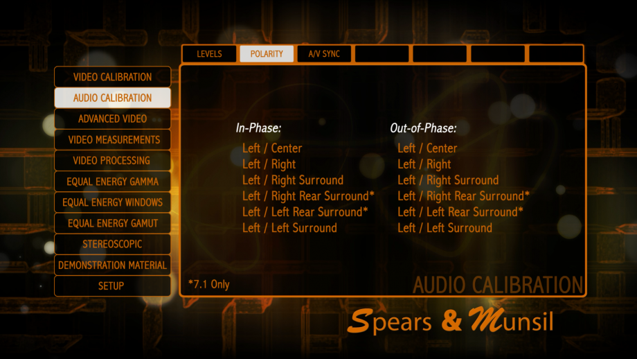
Polarity (in-phase)
This test is to check that all your speakers are connected with the same polarity. The front left speaker is always the reference speaker. The other speaker is the comparison speaker. For best results, for each speaker pair move to a location in the room where both speakers are in front of you, and face towards a spot midway between them.
The sound from the two speakers is now in phase. The sound should clearly appear to be coming from a point midway between the two speakers. If the sound is hard to pinpoint or seems to be coming from a point far away from the speakers, check the out-of-phase sound and see if it is easier to locate. If it is, switch the speaker wires connected to the comparison speaker (switch the wires from the red terminal to black, and vice versa). Then re-check.
To change to out-of-phase sound on the same speaker, push right on the Blu-ray disc player remote. To move to the next speaker, push right twice. To move to the previous speaker, push left.
NOTE: If your surround speakers are dipoles, they are designed to play both in- and out-of-phase simultaneously. If the sound is hard to pinpoint in both modes, the speakers are likely dipoles, and polarity does not need to be adjusted.
Polarity (out-of-phase)
This test is to check that all your speakers are connected with the same polarity. The front left speaker is always the reference speaker. The other speaker is the comparison speaker. For best results, for each speaker pair move to a location in the room where both speakers are in front of you, and face towards a spot midway between them.
The sound from the two speakers is now out of phase. The sound location should be hard to pinpoint or seem to be coming from a point far away from the speakers. If the sound clearly appears to be located midway between the speakers, check the in-phase sound and see if it is harder to locate. If so, switch the polarity of the speaker wires on the comparison speaker (switch the wires from the red terminal to black and vice versa). Then re-check.
To change to in-phase sound on the same speaker, push left on the Blu-ray disc player remote. To move to the next speaker, push right. To move to the previous speaker, push left twice.
NOTE: If your surround speakers are dipoles, they are designed to play both in- and out-of-phase simultaneously. If the sound is hard to pinpoint in both modes, the speakers are likely dipoles, and polarity does not need to be adjusted.
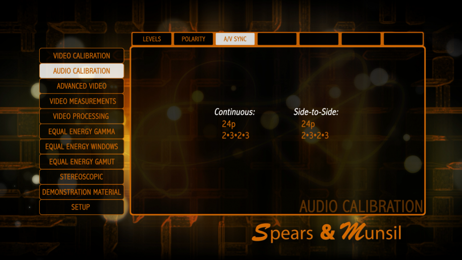
A/V Sync
This pattern is used to adjust the audio delay settings on your receiver or video processor.
Adjust the overall system delay to make the audio beep occur just as the moving box passes left to right over the center column. The top and bottom of the screen will flash at the same time.
As a cross-check, using your hands or a piece of cardboard with a small hole, block all of the screen except the number just before the zero mark. View it for a few seconds. The visible flash should appear to come before the beep. Now shift to the mark just after the zero mark, blocking out the rest of the screen. View it for a few seconds. The flash should appear to come after the beep. If either the marks before or after the zero mark seem to match the audio more closely than the zero mark itself, adjust the delay up or down to ensure that the flash at the zero mark happens closest to the audio beep.
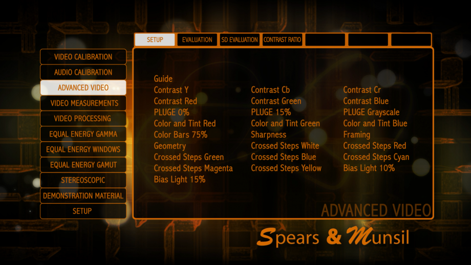
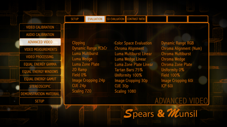
Advanced Video
This section of the disc contains patterns intended for use by the professional or advanced hobbyist who has some familiarity with video measurement and calibration. Using these patterns you can:
• Check for clipping in individual YCbCr and RGB channels
• Check for black level retention
• Perform color and tint cross-checks and check the color decoder for errors
• Measure and adjust framing and geometry
• Check gain and bias of each channel and do adjustments of gray scale tracking
• Adjust a bias light behind your display
As with the rest of the disc, there is help text for each of the patterns that can be brought up with the Up arrow on the Blu-ray Disc player remote while displaying the pattern. Keep in mind that some of these patterns are complex and cannot be fully explained in a short piece of help text. Nevertheless, we recommend browsing through the patterns and reading the help text, even if you’re not an expert. The way to become an expert is by reading, exploring, and asking questions!
If you are new to video calibration, some of the terms in the help text may be unfamiliar, or the intended usage of the pattern may be unclear. To find out more about these terms, we recommend one or more of the following:
• Reading the articles on the Spears and Munsil web site
• Doing internet searches on the names of the patterns and unfamiliar terms in the help text
• Reading and posting questions on internet forums like the AV Science Forums (http://www.avsforum.com) and Blu-ray Forum (http://forum.blu-ray.com)
• Reading books like Charles Poynton’s Digital Video and HDTV
Contrast
These patterns allow you to check for clipping and improper quantization in a single color channel.
At the top and bottom of the screen are colored boxes that allow you to quickly check for obvious clipping in one of the other channels. The numbered steps can show you how many levels, if any, are clipped in the channel you are viewing. If the display or processor is quantizing or rounding some levels incorrectly, you will see bands or streaks in the ramp in the center.
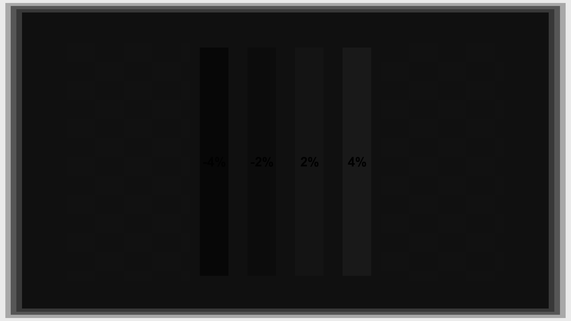
PLUGE
This is a basic PLUGE pattern, useful for setting and checking black level.
The “0%” version has a plain black background and is the standard pattern for setting black level with the Brightness control. The “15%” version has a gray surround, and the “Grayscale” version has several gray steps on screen. Those are used to check that black level doesn’t change when there is other bright content on the screen.
There are four bars on screen, set to -4%, -2%, 2%, and 4% gray, from left to right. When black level is set correctly, the two left bars will blend into the background and the two right bars will be visible. The 2% bar should be just barely visible, which the 4% bar should be fairly easy to see.
The background of this pattern is at digital level 16 (nominal black) with large rectangles of level 17. On some displays, the large rectangles will jump from invisible to visible when the black level is set correctly.
If the black level does change between the three patterns, you may want to adjust black level using all three patterns. Write down the Brightness control setting for each of the three patterns, then choose a final setting that is the average of the three numbers.
Color and Tint
These patterns are used to set and cross-check the Color and Tint controls and the color decoder.
To use them the display must offer separate red-only, green-only, and blue-only modes, or you will need a filter that can show you just the red, green, or blue channels. On some displays, the overlapping spectra of the red and green or blue and green channels make it impossible to use a filter with the green pattern, but most displays have blue and red channels that can work with a filter.
While using the filter or single-color mode, verify that the left bars disappear, then adjust Color until the top right boxes match and Tint until the bottom right boxes match. Once the pattern looks right with one color, it should remain good for the other colors. If one color looks wrong and the others look right, the color decoder is not converting YCbCr to RGB correctly.
Color Bars 75%
These are the standard color bars used to set Color and Tint.
We generally recommend using our Color and Tint patterns, but if you are more familiar with color bars, these will work fine.
While looking through a blue filter or using a blue-only mode on the display, the blue, white, cyan, and magenta bars should all be the same level and the green, red, and yellow bars should all turn black. If the green, red, and/or yellow bars don’t turn completely black, you need a stronger or more selective filter. Try looking through two thicknesses or three thicknesses of filter material, or use the convenient Spears & Munsil blue filter.
Once you have the correct filter, adjust the Color control until the blue and white bars match, and the Tint control until the cyan and magenta bars match.
Note that this version of the pattern is designed for viewing by eye or a meter, so the bars are generated with dither for higher accuracy. The Color Bars patterns in the Video Measurement section of the disc do not use dither, so they will be clean on a scope.
Sharpness
This pattern is used to set the Sharpness control.
This control should be set while seated in the normal viewing location. In general, you would like Sharpness to be set to the highest level that doesn’t produce distracting visual artifacts. When Sharpness is correct, you should not see ripples near any of the lines in the image. The vertical and horizontal lines should have clean, sharp edges with no ghost lines or bright halos next to them. The circles and diagonal lines should be smooth and free of stairstepping. The fine patterns on the top, bottom, left, and right edges of the screen should largely blend in with the background.
Start by turning up the Sharpness control until you start to see one or more of the artifacts listed above, then turn it down until the artifacts just barely disappear.
Framing
This pattern is used to check that the picture is centered, with equal overscan all around (if any).
It also has bars to show framing marks for various common video and film aspect ratios, for setting up masking or special zoom modes. The center ring of fine 2D burst pattern will show you instantly if the pattern has been scaled, as you’ll see moiré and streaks in it if the pixels are not being mapped 1:1 from the player and/or processor.
Geometry
This pattern is used to check that the display and/or video processor is not stretching or shrinking the image unequally in the horizontal or vertical direction.
Using a tape measure or ruler, measure the squares and circles in the corners and center of the screen. Ensure that the height of each matches the width. If all the circles are off by the same percentage, look for a control that adjusts picture height or picture width and adjust it up or down until the picture is correct.
If the circle in the center is correct but the ones on the edges are wrong, you may be in a non-linear stretch mode. Look through the picture modes and find one that shows the whole pattern, with all the circles looking circular and not oval.
Crossed Steps
These patterns are for a quick check that the complete dynamic range is visible from black to peak in all channels.
There are 11 steps, and each step should be visible and discernible from the adjacent level. If the dark levels blend into each other in all colors, the black level needs to be calibrated using the Brightness control and PLUGE pattern. If the top steps blend into each other in all colors, the peak level needs to be calibrated using the Contrast control and Contrast pattern.
If only certain colors are clipped while others are fine, the gain and bias controls may need adjustment. Usually these controls are only available in the service menu and it’s not recommended to adjust these without advanced calibration experience.
Note that this version of the pattern is designed for viewing by eye or a meter, so the bars are generated with dither for higher accuracy. The Crossed Steps White pattern in the Video Measurement section of the disc does not use dither, so it will be clean on a scope.
Bias Light
These patterns are designed to be a reference when setting up a bias light behind or around your display.
If you choose to use a bias light, decide whether you would prefer a 10% or 15% light, then use the appropriate pattern to show a reference on screen. Put the pattern up on screen, set up the bias light behind the display, and adjust the dimmer or mask the bias light so that the light spill right at the edge of the display matches the intensity of the on-screen rectangle.
Note that the reference is calculated in linear space, so if your display is not calibrated to 2.4 gamma, the reference level will not be perfectly correct. It should be close enough for this specific purpose of setting up a bias light.
Dynamic Range RGB
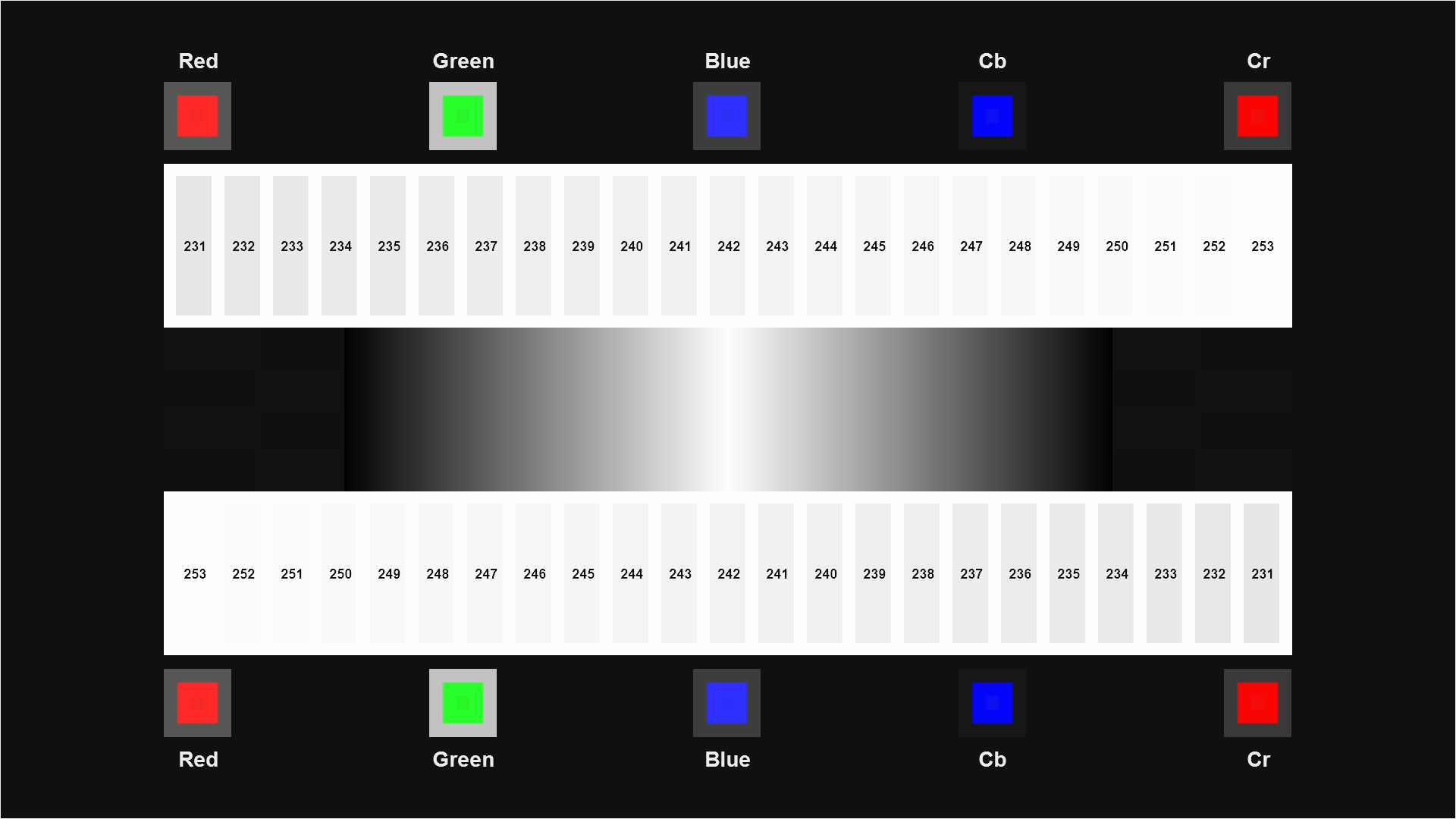
This is a convenient pattern that has the number boxes from the Contrast pattern for R, G, and B together on one screen.
It can be used to check for unequal clipping in any or all of the three channels. When everything is correct, all of the boxes except the last should be visually discernible against the background, though the last three or four may be difficult to make out unless you view the pattern in a dark room with your eyes completely adjusted to the light.
Note that this pattern requires correct below-black clipping in RGB to allow us to represent exact single steps in a single RGB channel. If the display is in xvYCC mode, or is using any complex non-linear chroma “enhancements” you may not see a monotonically increasing series of boxes. In such cases, try to find the setting on the display or processor that is triggering this behavior and turn it off.
The Green series uses YCbCr values that are entirely within the nominal range of 16-235, so it can always be used to check for clipping even if YCbCr clipping is occurring. The Blue and Red series have Cb or Cr values above 240, so if Cb and Cr clipping is occurring, those rows will look blank.
Dynamic Range YCbCr
This is a convenient pattern that has the number boxes from the Contrast pattern for Y, Cb, and Cr (top to bottom) together on one screen.
It can be used to check for unequal clipping in any or all of the three channels. When everything is correct, all of the boxes should be visible, though the last three or four may be difficult to make out unless you view the pattern in a dark room with your eyes completely adjusted to the light.
Note that improper clipping in RGB can make it appear that there is clipping in YCbCr when there is not. In order to make use of this pattern you must first verify that there is no clipping in RGB via the Clipping pattern. Chroma Alignment This pattern is used to verify that the chroma channels are properly aligned with the luma channels.
When everything is correct, the thin chroma lines will be perfectly centered, horizontally and vertically, inside the long skinny diamond shapes. In addition, all the boxes should have exactly identical edges on their left and right, and identical edges on their top and bottom.
When viewing this pattern, be sure you are viewing straight at each element from directly in front of that element, especially if you wear glasses. All glasses have chromatic aberration, and as you turn your head and look through the edges of the glasses, you will see the chroma lines move around relative to the luma lines. Even without glasses, certain display technologies are sensitive to the viewing angle and can have different amounts of chroma mismatch depending on the angle you view the screen.
This test can be thrown off by panel misalignments or chromatic aberration. These artifacts can only happen on projectors, either front or rear. Single-panel projectors such as single-chip DLPs cannot have panel misalignments. All projectors can have chromatic aberration. To check for these artifacts, look at the crosshairs in the corners and center. There should be no unequal color fringes on the sides of the thin white lines.
Chroma Alignment (Num)
This pattern is designed to quantify any chroma misalignment to roughly the nearest quarter-pixel.
View each of the thin diamond shapes and find the one where the colored line seems most perfectly centered in the thin diamond. The number above or to the left of that diamond tells you, in pixels, the misalignment of the chroma channel. If two adjacent diamonds are misaligned in opposite directions, the alignment error is midway between the number on those two diamonds.
See the help section for the main Chroma Alignment pattern for notes on chromatic aberration and viewing each element from directly in front of it with your head pointed straight forward.
Luma Multiburst
This pattern contains a variety of bursts, where the amplitude of the luma channel varies sinusoidally.
This pattern can be used to check on a scope or visually for resolution loss as a result of scaling or processing. All of the burst patterns should be clearly visible on a display with 1920×1080 or higher resolution. If the final burst with the thin lines appears brighter than the others, that is normal. Use the Luma Multiburst Linear pattern to visually check for any frequency unevenness.
Luma Multiburst Linear
This is a multiburst pattern where the bursts are calculated in radiometrically linear space, assuming a display gamma of 2.4.
On a display with gamma at or near 2.4, all bursts including the highest-frequency one should be visually the same brightness. If the highest-frequency burst is dimmer than the rest, there is some kind of high-frequency roll off being applied, or the gamma is very different from 2.4.
Chroma Multiburst
This is a multiburst pattern using the chroma channels.
Because the chroma channels are stored on disc at half the resolution of luma in both horizontal and vertical directions, the chroma bursts have twice the wavelength of the equivalent luma bursts. This pattern shows whether or not the full chroma resolution is making it all the way to the display. For example, if the highest-frequency vertical burst is a solid color or the lines are very dim, that suggests that some component in the signal chain is rolling off or downscaling vertically the chroma channel.
Luma Wedge
This pattern shows two wedges, each showing a sine wave at a wide range of wavelengths starting at the Nyquist wavelength of 2 pixels per cycle (PPC).
If the tip of one or both wedges is gray or not sharp, some amount of roll off or scaling is happening. Some moiré is normal near the tip end of a wedge, but really obvious or strong moiré can be a sign of scaling or excessive sharpening, or one of various non-linear edge “enhancement” algorithms in the display or processor.
If the luma channel is being rolled off in some way, one or the other wedge will have a gray section starting at the tip. You can read the effective luma resolution by looking for the point where the gray stops and the waves become clear and bright, then reading across to the resolution in pixels per cycle (PPC) or TV lines (TVL).
Luma Wedge Linear
This shows two wedges calculated in radiometrically linear space, assuming a display gamma of 2.4.
On such a display, the moiré should be very mild, and the overall visual brightness of each wedge should remain roughly constant from tip to base. If the tip of either wedge is much dimmer than the rest of the wedge, that suggests high-frequency roll off or scaling is being applied. Normally the moiré on this pattern is substantially less visible than it is on the regular Luma Wedge pattern. If the wedge is scaled or otherwise processed in a non-linear space, the moiré will become much more visible.
If the luma channel is being rolled off in some way, one or the other wedge will have a gray section starting at the tip. You can read the effective luma resolution by looking for the point where the gray stops and the waves become clear and bright, then reading across to the resolution in pixels per cycle (PPC) or TV lines (TVL).
Chroma Wedge
This pattern shows two wedges in the chroma channel.
Because the chroma channel is stored on disc at half the resolution of luma in both horizontal and vertical directions, the chroma wedges have double the wavelengths of the equivalent vertical wedges.
If the chroma channel is being rolled off in some way, one or the other wedge will have a dimmer section starting at the tip. You can read the effective chroma resolution by looking for the point where the dim color stops and the color becomes clear and bright, then reading across to the resolution in pixels per cycle (PPC) or TV lines (TVL).
Luma Zone Plate
This pattern shows a sine wave in the luma channel rotated around the center of the screen, varying its wavelength smoothly as it gets further and further from the center.
If any frequencies are being rolled off, portions of this pattern near the edges will turn gray. If excessive sharpening or poor scaling is being performed, the moiré in the pattern will become stronger and the smooth rounded edges will show jaggies and stairstepping.
Luma Zone Plate Linear
This is identical to the regular Zone Plate pattern, but generated in radiometrically linear space, assuming a display gamma of 2.4. On such a display, the overall visual brightness of the pattern should be roughly constant across the entire pattern.
If the brightness is lower or higher at the edges of the pattern, that suggests that some boost or rolloff of the high frequencies is occurring or the gamma of the display is very different from 2.4. Normally this pattern has substantially less visible moiré than the regular Luma Zone Plate. If this pattern is scaled or processed in a non-linear color space, the moiré will get much more visible.
Chroma Zone Plate
This pattern shows a sine wave in the chroma channels rotated around the center of the screen, varying its wavelength smoothly as it gets further and further from the center.
If any frequencies are being rolled off, portions of this pattern near the edges will turn dim, and sometimes turn black or a solid dark color.
2D Ramp
This is a horizontal and vertical luma ramp in one pattern.
If there are any streaks or bands in the ramp, that suggests that improper rounding or quantization is occurring somewhere in the signal chain. If the center has a wide solid white square, that shows clipping in the luma channel or in RGB.
Tartan Bars 75%
This pattern contains all the possible horizontal and vertical transitions between all of the primary and secondary colors (red, green, blue, cyan, magenta, yellow), plus black and white.
It is useful for visual evaluation of the various RGB transitions and verifying that they are clean and there are no obvious artifacts. Note that this pattern uses dither, which will show up as low-level noise on a scope.
Uniformity 0%
This pattern is used for checking screen brightness uniformity with a light meter.
Measure each patch with a light meter pointed directly perpendicular to the screen, or as perpendicular as possible. Alternatively, you can use this pattern just to set the aiming point for each measurement, then switch to Field 0% by pushing right on the remote, then perform the measurement. A quality display should have no measurement further than +/-5% from the average of all measurements.
We have a free Excel file available for download on our web site that will calculate the max uniformity deviation for you give the 13 measurements.
Field 0%
This is a simple 0% (black) field covering the entire screen.
It is useful for measuring residual light on a black screen and visually looking for uniformity problems. It can also be used to measure uniformity by using the Uniformity 0% pattern as an aiming reference, then switching to this pattern to perform the measurement.
Uniformity 100%
This pattern is used for checking screen brightness uniformity with a light meter.
Measure each patch with a light meter pointed directly perpendicular to the screen, or as perpendicular as possible. Alternatively, you can use this pattern just to set the aiming point for each measurement, then switch to Field 100% by pushing right on the remote, then perform the measurement. A quality display should have no single measurement further than +/-5% from the average of all measurements. We have a free Excel file available for download on our web site that will calculate the max uniformity deviation for you give the 13 measurements.
Field 100%
This is a simple 100% (nominal white) field covering the entire screen.
It is useful for measuring nominal white light level and visually looking for uniformity problems. It can also be used to measure uniformity by using the Uniformity 100% pattern as an aiming reference, then switching to this pattern to perform the measurement.
Image Cropping This is a pattern to measure how many pixels, if any, are being cropped by your player, processor, and/or display.
It can also be useful in centering the picture exactly if there is cropping. You can read the cropping in pixels by looking at the number labeling the highest visible line on the each edge of the screen.
There are versions of this pattern at different frame rates because some displays have different memories and/or different default cropping amounts for each different input frame rate.
Chroma Upsampling Error
This pattern is designed to show the effects of the Chroma Upsampling Error (CUE) first documented by Spears & Munsil in the online magazine Secrets of Home Theater and High Fidelity.
If your player has the error, the diagonal lines will not be smooth, but will have small jagged segments along them. It can look like a scalloped edge, a zig-zag edge, or a stairstepped edge. Anything other than a smooth clean edge raises suspicion of CUE, and a clear zig-zag pattern is definitive evidence of CUE.
There are two versions of this covering the two common progressive frame rates used in HD video.
Interlaced Chroma Problem
This pattern is designed to show the effects of the Interlace Chroma Problem (ICP) first documented by Spears & Munsil in the online magazine Secrets of Home Theater and High Fidelity.
It can also be used to check the effectiveness of the ICP “fix” features found in various processors and players. This is not a bug; it is an artifact that occurs because of a limitation in the encoding of chroma in interlaced content. All interlaced content, including HD content, will suffer from this problem to some extent.
The effect looks very similar to CUE – diagonal chroma edges will not be smooth, but will instead have zig-zag or scalloped edges. If you have a processor or player with CUE/ICP removal, turning it off and on should show a marked difference in the smoothness of the diagonals.
Scaling
This pattern is designed to show artifacts caused by scaling in the display, video processor, or player.
Artifacts to look for include jagged or stairstepped edges on the diagonal and curved lines, Ringing, ripples, or “halos” near sharp edge transitions, and moiré, bands, or streaks in the fine detail patterns across the horizontal and vertical center of the screen. Also, the fine detail patterns of thin lines and small checkerboards should visually match the brighter of the two backgrounds most closely. If they match the darker background, that’s a sign that the scaling is not being performed in a linear color space.
If your player has the option of outputting everything at 1080 or outputting 720 and 480 content at their native resolution, try switching between the various modes to see how the scaling quality differs. You may find that your display does a better job of scaling than your player, or vice-versa.
Note that the 1080 pattern may not be scaled at all, if your display is 1920×1080 and has a 1:1 pixel mode and no overscan.
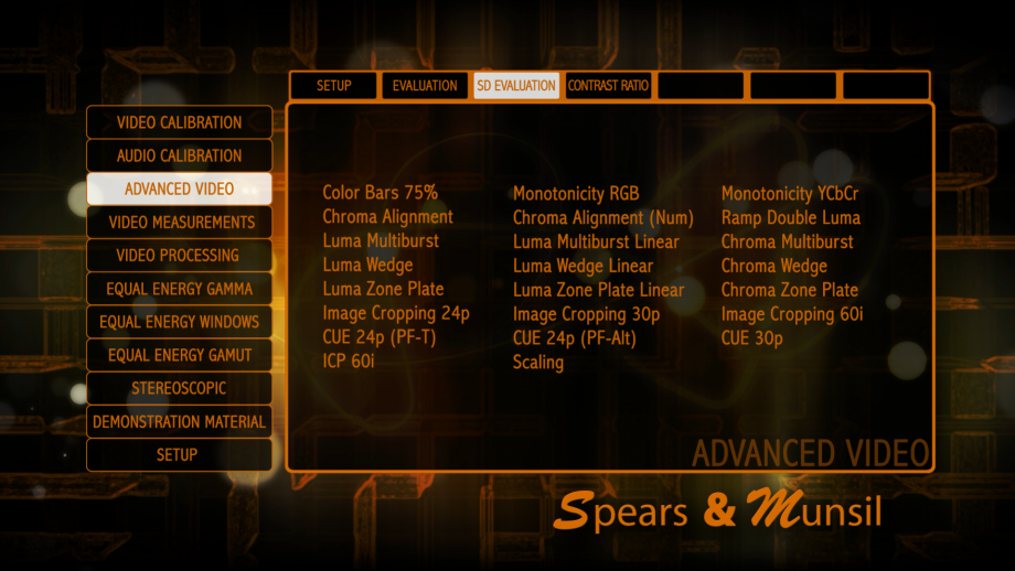
Color Bars 75%
This is the standard definition (720×480) version of Color Bars.
These are the standard color bars used to set Color and Tint. We generally recommend using our Color and Tint patterns, but if you are more familiar with color bars, these will work fine. While looking through a blue filter or using a blue-only mode on the display, the blue, white, cyan, and magenta bars should all be the same level and the green, red, and yellow bars should all turn black. If the green, red, and/or yellow bars don’t turn completely black, you need a stronger or more selective filter. Try looking through two thicknesses or three thicknesses of filter material, or use the convenient Spears & Munsil blue filter. Once you have the correct filter, adjust the Color control until the blue and white bars match, and the Tint control until the cyan and magenta bars match.
Note that this version of the pattern is designed for viewing by eye or a meter, so the bars are generated with dither for higher accuracy. The Color Bars patterns in the Video Measurement section of the disc do not use dither, so they will be clean on a scope.
Monotonicity RGB
This is the standard definition (720×480) version of Monotonicity RGB.
This pattern has small patches that show all encodable 8-bit levels of R, G, and B, starting at 0 and going up to 255 in each channel. This pattern is intended to be evaluated with a waveform monitor or HDMI analyzer to validate that all levels are present and are not being rounded or quantized improperly.
Note that this pattern requires correct below-black clipping in RGB to allow us to represent exact single steps in a single RGB channel. If the display is in xvYCC mode, or is using any complex non-linear chroma “enhancements” you may not see a monotonically increasing series of boxes. In such cases, try to find the setting on the display or processor that is triggering this behavior and turn it off.
Monotonicity YCbCr
This is the standard definition (720×480) version of Monotonicity YCbCr.
This pattern has small patches that show all encodable 8-bit levels of Y, Cb, and Cr, starting at 1 and going up to 254 in each channel. This pattern is intended to be evaluated with a waveform monitor or HDMI analyzer to validate that all levels are present and are not being rounded or quantized improperly.
Chroma Alignment
This is the standard definition (720×480) version of Chroma Alignment.
This pattern is used to verify that the chroma channels are properly aligned with the luma channels. When everything is correct, the thin chroma lines will be perfectly centered, horizontally and vertically, inside the long skinny diamond shapes. In addition, all the boxes should have exactly identical edges on their left and right, and identical edges on their top and bottom.
When viewing this pattern, be sure you are viewing straight at each element from directly in front of that element, especially if you wear glasses. All glasses have chromatic aberration, and as you turn your head and look through the edges of the glasses, you will see the chroma lines move around relative to the luma lines. Even without glasses, certain display technologies are sensitive to the viewing angle and can have different amounts of chroma mismatch depending on the angle you view the screen. This test can be thrown off by panel misalignments or chromatic aberration. These artifacts can only happen on projectors, either front or rear. Single-panel projectors such as single-chip DLPs cannot have panel misalignments. All projectors can have chromatic aberration. To check for these artifacts, look at the crosshairs in the corners and center. There should be no unequal color fringes on the sides of the thin white lines.
Chroma Alignment (Num)
This is the standard definition (720×480) version of Chroma Alignment (Num).
This pattern is designed to quantify any chroma misalignment to roughly the nearest quarter-pixel. View each of the thin diamond shapes and find the one where the colored line seems most perfectly centered in the thin diamond. The number above or to the left of that diamond tells you, in pixels, the misalignment of the chroma channel. If two adjacent diamonds are misaligned in opposite directions, the alignment error is midway between the number on those two diamonds.
See the help section for the main Chroma Alignment pattern for notes on chromatic aberration and viewing each element from directly in front of it with your head pointed straight forward.
Ramp Double Luma
This is the standard definition (720×480) equivalent of 2D Ramp.
This is a double ramp in the luma channel. If there are any streaks or bands in the ramp, that suggests that improper rounding or quantization is occurring somewhere in the signal chain. If the center has a wide solid white band, that shows clipping in the luma channel or in RGB.
Luma Multiburst
This is the standard definition (720×480) version of Luma Multiburst.
This pattern contains a variety of bursts, where the amplitude of the luma channel follows a sine wave. This pattern can be used to check on a scope or visually for resolution loss as a result of scaling or processing. All of the burst patterns should be clearly visible on a display with 720×480 or higher resolution. If the final burst with the thin lines appears brighter than the others, that is normal. Use the Luma Multiburst Linear to visually check for any frequency unevenness.
Luma Multiburst Linear
This is the standard definition (720×480) version of Luma Multiburst Linear.
This is a multiburst pattern where the bursts are calculated in radiometrically linear space, assuming a display gamma of 2.4. On such a display, all bursts including the highest-frequency one should be visually the same brightness. If the highest-frequency burst is dimmer than the rest, there is some kind of high-frequency roll off being applied, or the gamma is very different from 2.4.
Chroma Multiburst
This is the standard definition (720×480) version of Chroma Multiburst.
This is a multiburst pattern using the chroma channels. Because the chroma channels are stored on disc at half the resolution of luma in both horizontal and vertical directions, the chroma bursts have twice the wavelength of the equivalent luma bursts. This pattern shows whether or not the full chroma resolution is making it all the way to the display. For example, if the highest-frequency vertical burst is very dim or a solid dark color, that suggests that some component in the signal chain is rolling off or downscaling vertically the chroma channel.
Luma Wedge
This is the standard definition (720×480) version of Luma Wedge.
This pattern shows two wedges, each showing a sine wave at a wide range of wavelengths starting at the Nyquist wavelength of 2 pixels per cycle (PPC). If the tip of one or both wedges is gray or not sharp, some amount of roll off or scaling is happening. Some moiré is normal near the tip end of a wedge, but really obvious or strong moiré can be a sign of scaling or excessive sharpening, or one of various non-linear edge “enhancement” algorithms in the display or processor. If the luma channel is being rolled off in some way, one or the other wedge will have a gray section starting at the tip. You can read the effective luma resolution by looking for the point where the gray stops and the waves become clear and bright, then reading across to the resolution in pixels per cycle (PPC) or TV lines (TVL).
Luma Wedge Linear
This is the standard definition (720×480) version of Luma Wedge Linear.
This shows two wedges calculated in radiometrically linear space, assuming a display gamma of 2.4.
On such a display, the moiré should be very mild, and the overall visual brightness of each wedge should remain roughly constant from tip to base. If the tip of either wedge is much dimmer than the rest of the wedge, that suggests high-frequency roll off or scaling is being applied. Normally the moiré on this pattern is substantially less visible than it is on the regular Luma Wedge pattern. If the wedge is scaled or otherwise processed in a non-linear space, the moiré will become much more visible. If the luma channel is being rolled off in some way, one or the other wedge will have a gray section starting at the tip. You can read the effective luma resolution by looking for the point where the gray stops and the waves become clear and bright, then reading across to the resolution in pixels per cycle (PPC) or TV lines (TVL).
Chroma Wedge
This is the standard definition (720×480) version of Chroma Wedge.
This pattern shows two wedges in the chroma channel. Because the chroma channel is stored on disc at half the resolution of luma in both horizontal and vertical directions, the chroma wedges have double the wavelengths of the equivalent vertical wedges. If the chroma channel is being rolled off in some way, one or the other wedge will have a gray section starting at the tip. You can read the effective chroma resolution by looking for the point where the dim or solid color stops and the color is clear and bright, then reading across to the resolution in pixels per cycle (PPC) or TV lines (TVL).
Luma Zone Plate
This is the standard definition (720×480) version of Luma Zone Plate.
This pattern shows a sine wave in the luma channel rotated around the center of the screen, varying its wavelength smoothly as it gets further and further from the center. If any frequencies are being rolled off, portions of this pattern near the edges will turn gray. If excessive sharpening or poor scaling is being performed, the moiré in the pattern will become stronger and the smooth rounded edges will show jaggies and stairstepping.
Luma Zone Plate Linear
This is the standard definition (720×480) version of Luma Zone Plate Linear.
This is identical to the regular Zone Plate pattern, but generated in radiometrically linear space, assuming a display gamma of 2.4. On such a display, the overall visual brightness of the pattern should be roughly constant across the entire pattern. If the brightness is lower or higher at the edges of the pattern, that suggests that some boost or rolloff of the high frequencies is occurring or the gamma of the display is very different from 2.4. Normally this pattern has substantially less visible moiré than the regular Luma Zone Plate. If this pattern is scaled or processed in a non-linear color space, the moiré will get much more visible.
Chroma Zone Plate
This is the standard definition (720×480) version of Chroma Zone Plate.
This pattern shows a sine wave in the chroma channels rotated around the center of the screen, varying its wavelength smoothly as it gets further and further from the center. If any frequencies are being rolled off, portions of this pattern near the edges will get dimmer and may turn to a solid dark color.
Image Cropping
This is the standard definition (720×480) version of Image Cropping.
This is a pattern to measure how many pixels, if any, are being cropped by your player, processor, and/or display. It can also be useful in centering the picture exactly, if there is cropping. You can read the cropping in pixels by looking at the number labeling the highest visible line on the each edge of the screen.
There are versions of this pattern at different frame rates because some displays have different memories and/or different default cropping amounts for each different input frame rate.
Chroma Upsampling Error
This is the standard definition (720×480) version of CUE.
This pattern is designed to show the effects of the Chroma Upsampling Error (CUE) first documented by Spears & Munsil in the online magazine Secrets of Home Theater and High Fidelity. If your player has the error, the diagonal lines will not be smooth, but will have small jagged segments along them. It can look like a scalloped edge, a zig-zag edge, or a stairstepped edge. Anything other than a smooth clean edge raises suspicion of CUE, and a clear zig-zag pattern is definitive evidence of CUE.
There are three versions of this covering the two most common pulldown and flag combinations used to map 24 fps content to 60i video and one 30 fps progressive mode.
Interlaced Chroma Problem
This pattern is designed to show the effects of the Interlace Chroma Problem (ICP) first documented by Spears & Munsil in the online magazine Secrets of Home Theater and High Fidelity.
It can also be used to check the effectiveness of the ICP “fix” features found in various processors and players. This is not a bug; it is an artifact that occurs because of a limitation in the encoding of chroma in interlaced content. All interlaced content, including HD content, will suffer from this problem to some extent.
The effect looks very similar to CUE – diagonal chroma edges will not be smooth, but will instead have zig-zag or scalloped edges. If you have a processor or player with CUE/ICP removal, turning it off and on should show a marked difference in the smoothness of the diagonals.
Scaling
This pattern is designed to show artifacts caused by scaling in the display, video processor, or player.
Artifacts to look for include jagged or stairstepped edges on the diagonal and curved lines, Ringing, ripples, or “halos” near sharp edge transitions, and moiré, bands, or streaks in the fine detail patterns across the horizontal and vertical center of the screen. Also, the fine detail patterns of thin lines and small checkerboards should visually match the brighter of the two backgrounds most closely. If they match the darker background, that’s a sign that the scaling is not being performed in a linear color space.
If your player has the option of outputting everything at 1080 or outputting 720 and 480 content at their native resolution, try switching between the various modes to see how the scaling quality differs. You may find that your display does a better job of scaling than your player, or vice-versa.
Note that the 1080 pattern may not be scaled at all, if your display is 1920×1080 and has a 1:1 pixel mode and no overscan.
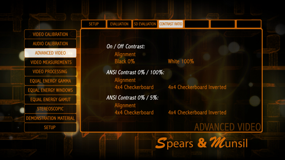
On/Off Alignment
This pattern has a crosshair to facilitate aiming of a light meter at the center of the screen.
On/Off Black 0%
This pattern is a black field used for measuring the baseline black level of the display.
On/Off White 100%
This is a white window used for measuring the 100% nominal white level of the display.
ANSI 0% / 100% Alignment
This pattern has crosshairs to facilitate aiming a light meter at each of the rectangles in a standard ANSI Contrast checkerboard pattern.
ANSI 0% / 100% 4×4 Checkerboard
This is a standard ANSI checkerboard with 16 rectangles, of which half are at 0% and half at 100%.
ANSI 0% / 100% 4×4 Checkerboard Inverted
This is a standard ANSI checkerboard with 16 rectangles, of which half are at 0% and half at 100%. The pattern is inverted compared to the previous pattern.
ANSI 0% / 5% Alignment
This pattern has crosshairs to facilitate aiming a light meter at each of the rectangles in a standard ANSI Contrast checkerboard pattern.
ANSI 0% / 5% 4×4 Checkerboard
This is a standard ANSI checkerboard with 16 rectangles, of which half are at 0% and half at 5%.
ANSI 0% / 5% 4×4 Checkerboard Inverted
This is a standard ANSI checkerboard with 16 rectangles, of which half are at 0% and half at 5%. The pattern is inverted compared to the previous pattern.
Video Measurement
This section of the disc contains patterns that are generally intended to be used with test equipment such as spectroradiometers, colorimeters, waveform monitors, HDMI analyzers, and so forth. For the most part these patterns are designed for use by professional calibrators and very advanced hobbyists. Even if you don’t fall into those categories, you may find it interesting to browse through the patterns and read the help text (available by pressing Up on the Blu-ray Disc player remote).
Some of the patterns can be valuable for certain tests and evaluations even without test equipment. For example, if you suspect that your display or video processor is not providing the full chroma bandwidth you should be getting, the Chroma Multiburst, Chroma Wedge, and Chroma Zone Plate patterns in the Advanced Video section will tell you if something is wrong, but the more specific multiburst, wedge, and zone plate patterns in the Video Measurement section will allow you to isolate which specific video channel is involved.
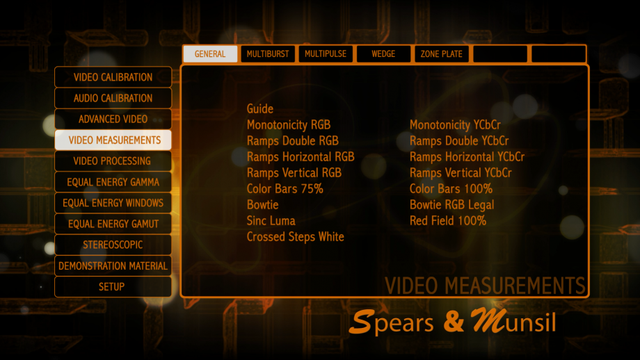
Monotonicity RGB
This pattern has small patches that show all encodable 8-bit levels of R, G, and B, starting at 0 and going up to 255 in each channel.
This pattern is intended to be evaluated with a waveform monitor or HDMI analyzer to validate that all levels are present and are not being rounded or quantized improperly.
Note that this pattern requires correct below-black clipping in RGB to allow us to represent exact single steps in a single RGB channel. If the display is in xvYCC mode, or is using any complex non-linear chroma “enhancements” you may not see a monotonically increasing series of boxes. In such cases, try to find the setting on the display or processor that is triggering this behavior and turn it off.
Monotonicity YCbCr
This pattern has small patches that show all encodable 8-bit levels of Y, Cb, and Cr, starting at 1 and going up to 254 in each channel.
This pattern is intended to be evaluated with a waveform monitor or HDMI analyzer to validate that all levels are present and are not being rounded or quantized improperly.
Ramps
These patterns each have three ramps in either RGB or YCbCr, either double ramps where the ramp goes from black to peak (or peak to peak for Cb and Cr) and back, or single ramps that go from black at one end to peak at the other (or peak to opposite peak for Cb and Cr).
All ramps should look smooth and regular, with no bands or streaks across them. It can be very revealing to adjust the Contrast control up and down while viewing an RGB ramp. One some displays you will see streaks and bands form and move around the ramp as the control is moved up and down, which is a sign that the display is doing its video processing at too low a bit depth to properly implement the standard video controls without introducing banding.
Color Bars
These are the standard color bars used to set Color and Tint.
We generally recommend using our Color and Tint patterns, but if you are more familiar with color bars, these will work fine.
While looking through a blue filter or using a blue-only mode on the display, the blue, white, cyan, and magenta bars should all be the same level and the green, red, and yellow bars should all turn black. If the green, red, and/or yellow bars don’t turn completely black, you need a stronger or more selective filter. Try looking through two thicknesses or three thicknesses of filter material, or use the convenient Spears & Munsil blue filter. Once you have the correct filter, adjust the Color control until the blue and white bars match, and the Tint control until the cyan and magenta bars match.
There are two versions of this pattern that only vary in the amplitude of the bars, either at 75% of nominal or 100% of nominal. Note that this version of the pattern is designed for viewing on a scope, so the bars are generated without dither for a cleaner signal trace. The Color Bars patterns in the Advanced Video section of the disc uses dither for more accuracy by eye or with a light meter or colorimeter. Bowtie (both) This pattern is for measuring chroma delay, but is only useful for viewing on a waveform monitor.
By switching the monitor to Y-Cb or Y-Cr, you can see a “bowtie” shape on the monitor screen that is centered if the chroma channel is perfectly aligned horizontally with the luma channel. If the center of the bowtie is slightly left or right of center, the chroma channel is delayed or advanced relative to the luma channel. There are markers that are visible on the scope that are calibrated to increments of 0.5 pixels of delay. There are two versions of this pattern. One is RGB legal, which is useful if something in the signal path requires an RGB legal signal. It is slightly lower amplitude and harder to read than the standard version, so the standard version should be used when possible.
Sinc Luma
This pattern contains a single sinc pulse horizontally in the luma channel.
This is used to see certain kinds of processing errors using a waveform monitor.
Red Field 100%
This is a simple 100% red field used as a standard for calculating picture signal to noise ratio.
It is designed for evaluating with a video waveform analyzer, so it has no dither, which would show up as extra noise in the calculation.
Crossed Steps White
These patterns are for a quick check that the complete dynamic range is being generated from black to peak in all channels.
Note that this version of the pattern is designed for viewing on a scope, so the bars are generated without dither for a clean scope trace. The Crossed Steps patterns in the Advanced Video section of the disc have dither for better accuracy with a light meter or colorimeter.
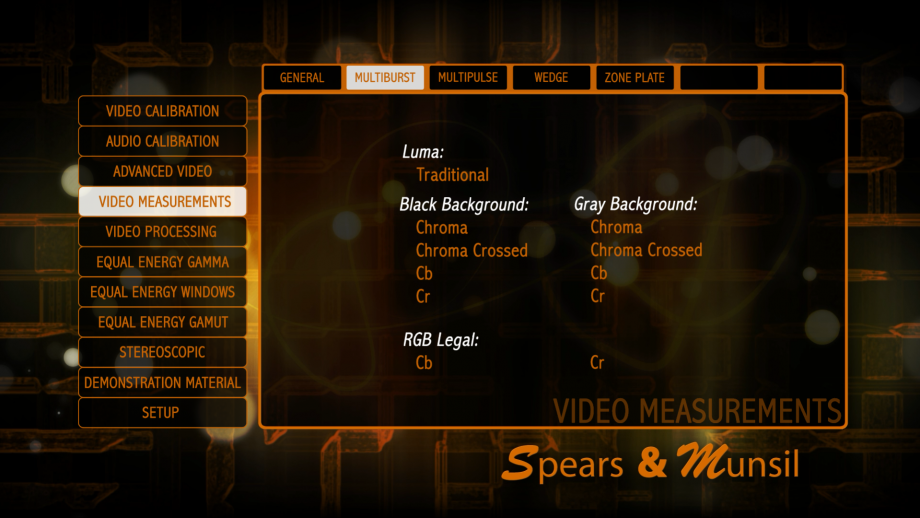
Multiburst Luma
This pattern contains a variety of bursts, where the amplitude of the luma channel varies sinusoidally.
This pattern can be used to check on a scope or visually for resolution loss as a result of scaling or processing. All of the burst patterns should be clearly visible on a display with 1920×1080 or higher resolution. If the final burst with the thin lines appears brighter than the others, that is normal. Use the Luma Multiburst Linear pattern to visually check for any frequency unevenness.
Multiburst Chroma
The chroma multibursts come in many flavors to isolate individual channels or to show interactions between the channels.
They can be viewed with a luma channel that is either black (0%) or gray (50%), or in an RGB legal form where luma varies with the chroma channel to keep R, G, and B always within nominal (0-100%) levels. The “chroma” version varies both chroma channels together, and the “chroma crossed” varies the chroma channels with opposite peaks, so one is at one peak (240) when the other is at the opposite peak (16) and vice-versa.
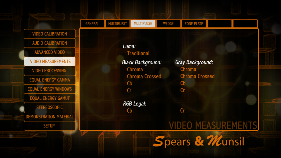
Multipulse Luma
This pattern has several pulses at different frequencies that can be viewed on a scope to see frequency rolloffs and phase errors in the luma channel.
Multipulse Chroma
The chroma multipulses come in many flavors to isolate individual channels or to show interactions between the channels.
They can be viewed with a luma channel that is either black (0%) or gray (50%), or in an RGB legal form where luma varies with the chroma channel to keep R, G, and B always within nominal (0-100%) levels. The “chroma” version varies both chroma channels together, and the “chroma crossed” varies the chroma channels with opposite peaks, so one is at one peak (240) when the other is at the opposite peak (16) and vice-versa.
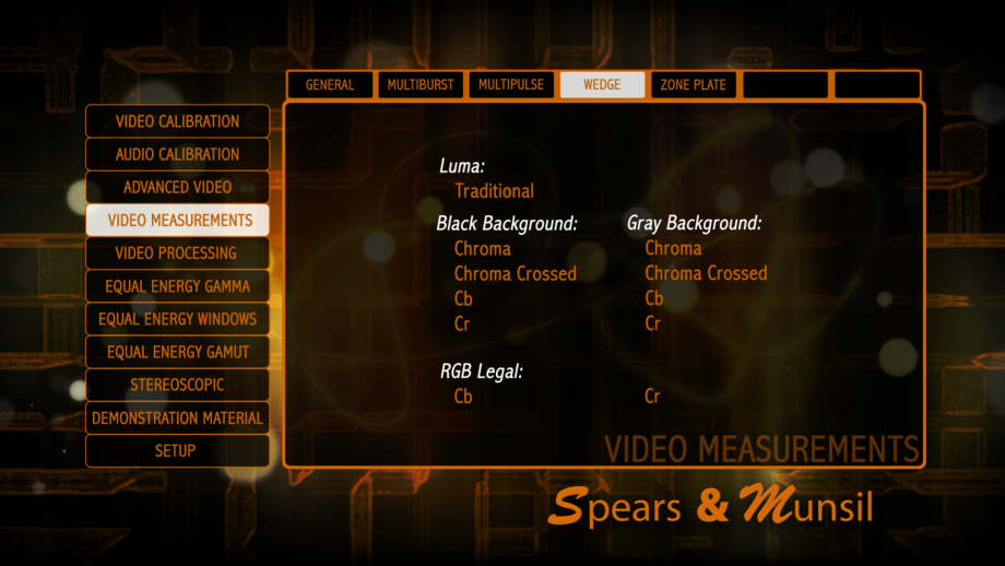
Wedge Luma
This pattern has two wedges, each showing wide range of wavelengths starting at the Nyquist wavelength of 2 pixels per cycle (PPC).
Wedge Chroma
The chroma wedges come in many flavors to isolate individual channels or to show interactions between the channels.
They can be viewed with a luma channel that is either black (0%) or gray (50%), or in an RGB legal form where luma varies with the chroma channel to keep R, G, and B always within nominal (0-100%) levels. The “chroma” version varies both chroma channels together, and the “chroma crossed” varies the chroma channels with opposite peaks, so one is at one peak (240) when the other is at the opposite peak (16) and vice-versa.
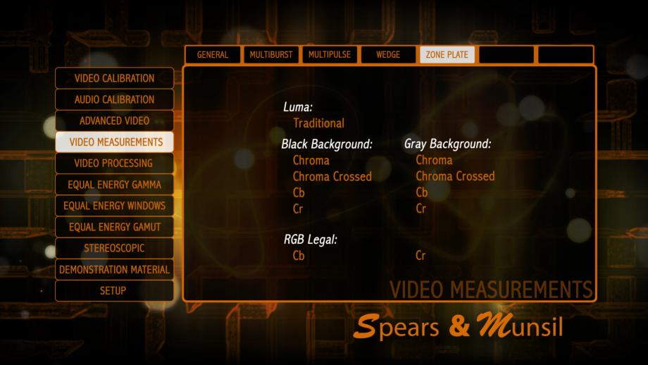
Zone Plate Luma
This pattern has a full screen zone plate in luma, designed for viewing on a waveform monitor.
Zone Plate Chroma
The chroma zone plates come in many flavors to isolate individual channels or to show interactions between the channels.
They can be viewed with a luma channel that is either black (0%) or gray (50%), or in an RGB legal form where luma varies with the chroma channel to keep R, G, and B always within nominal (0-100%) levels. The “chroma” version varies both chroma channels together, and the “chroma crossed” varies the chroma channels with opposite peaks, so one is at one peak (240) when the other is at the opposite peak (16) and vice-versa.
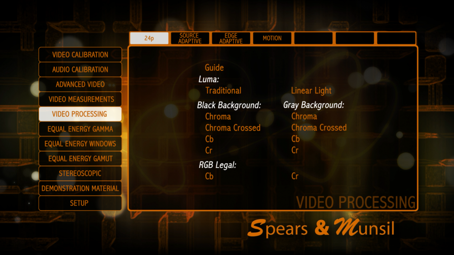
Video Processing
This section of the disc is devoted to patterns to check for video processing issues, including frame rate judder and other motion processing artifacts, deinterlacing and interpolation issues, and motion color range limitations, also called “motion banding.”
These patterns are not generally for calibration; they are here to evaluate how well your player and display together handle various difficult video processing scenarios. They are extremely useful for evaluating equipment you intend to buy, but they are also useful in evaluating which of the many different video processing modes works best on your display and/or Blu-ray Disc player. If you have wondered what “Super Motion Processing” or “Advanced Film Source Detection” modes do and whether you should turn them off or on, this section can help you decide.
By default, the deinterlacing patterns (found under the Source Adaptive and Edge Adaptive submenus) will display in HD resolution, 1080i. To see all of them in SD resolution (480i), change the setting in the Settings menu, found on the main menu.
As with all the other patterns, help text is available by pressing the Up button on your Blu-ray Disc player remote.
24p
This pattern shows a moving wedge at 24 fps.
If your Blu-ray Disc player, video processor, and display have the capability of handling 24 fps, and are all in 24 fps mode, the wedge should move smoothly and cleanly with no hiccups or judder. If the wedge stutters or judders, or does not move clearly smoother than the 2•3 pulldown versions in the next section, it is possible that your signal chain is not properly set up to display 24 frame content at 24 frames per second, and instead you are seeing 24 converted to 60 with 2•3 pulldown applied. The various chroma wedges are here to check for changes in chroma processing in true 24p mode.
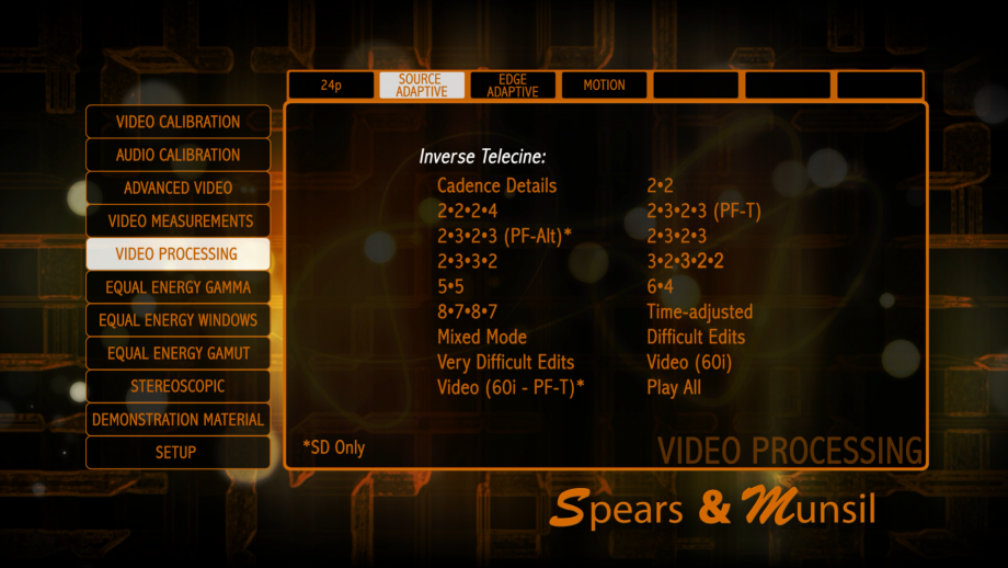
Source Adaptive Cadence Details
2•2:
Used for 30 fps progressive, produced by some video cameras and CG graphics generators.
2•2•2•4:
A less common way of converting film rate to video used for some older film transfers and some older camcorders.
2•3•2•3 (PF-T):
The standard film-to-video cadence, with standard progressive-frame flags.
2•3•2•3 (PF-Alt):
The standard film-to-video cadence, with the progressive-frame flag turning on and off every other frame. Some buggy MPEG-2 compressors encode film-source video this way.
2•3•2•3:
The standard film-to-video cadence, with no progressive frames marked. This is very common in broadcast video, but not as common on discs.
2•3•3•2:
This cadence is used by some camcorders that have a 24p “film look” mode.
3•2•3•2•2:
This cadence usually occurs when film is transferred at slightly higher speed to condense it for time.
5•5:
This cadence is used when 12fps animation is transferred to video.
6•4:
This cadence can occur when 12fps animation is transferred to video in multiple stages.
8•7•8•7:
This cadence is used when 8fps animation (sometimes used for Japanese anime) is transferred to video.
Numbered cadences
This is progressive (film) sourced content transferred to video. A good deinterlacer should be able to recreate perfect frames from this clip and stay in film mode continuously. When a deinterlacer cannot identify the original frames, it either switches to video mode, which is easily seen because the horizontal wedge shows huge moiré, or it “combs”, which is when it combines fields from two frames that don’t go together, producing jagged lines that look like the tines of a comb along the edge of the vertical wedge. For details about the specific cadence, select the “Cadence Details” menu item.
Time-adjusted
This is video that has been transferred from film using standard 2•3 pulldown, then time-condensed slightly in the video domain, removing one field every few seconds. A good deinterlacer should only occasionally drop into video mode when the cadence breaks.
Mixed Mode
This is a sequence that alternates regularly between video source (60i) and film source (24p) content that has been transferred to video using the standard 2•3 pulldown cadence. Deinterlacers will generally not be able to reconstruct full-resolution frames while the content is video-sourced, but should quickly return to progressive film mode when the content switches back to film-source.
Video (60i)
This is a sequence that is encoded like a video source (60i), with no pulldown at all. Very few deinterlacers will be able to reconstruct full frames from this material, so it is normal to see moiré and blurry details on the wedges. However, any good deinterlacer should recognize that the sequence is video format and avoid combing artifacts.
By comparing this test to the similar test labeled “Video (60i – PF-T)” you can tell if the player is using the encoded flags on the disc to identify progressive content. If both tests look identical, the player is ignoring the flags. If this test looks OK and the PF-T version looks bad, the player is using the flags.
Video (60i – PF-T)
This is a sequence that is encoded like a video source (60i), with no pulldown at all. In this version, the flags encoded in the MPEG-2 video frames are set (incorrectly) to “true.” Very few deinterlacers will be able to reconstruct full frames from this material, so it is normal to see moiré and blurry details on the wedges. However, any good deinterlacer should recognize that the sequence is video format and avoid combing artifacts. By comparing this test to the similar test labeled “Video (60i – PF-T)” you can tell if the player is using the encoded flags on the disc to identify progressive content. If both tests look identical, the player is ignoring the flags. If this test looks OK and the PF-T version looks bad, the player is using the flags.
Difficult Edits
This runs through a sequence of edits that are common with content that has been originally shot on film, transferred to video using the standard 2•3 cadence, and then edited in the video domain.
Every time there is an edit, it breaks the 2•3 cadence in some way, and this sequence runs through all of the potential breaks that have a full frame from the original film-source content available on both sides of the edit. A good deinterlacer should stay in film mode continuously during this entire sequence, and never drop into video mode.
Very Difficult Edits
This runs through a sequence of edits that are common with content that has been originally shot on film, transferred to video using the standard 2•3 cadence, and then edited in the video domain.
Every time there is an edit, it breaks the 2•3 cadence in some way, and this sequence runs through all of the potential breaks that have only one field from one of the frames on one side or the other of the edit. No deinterlacer can reconstruct a full progressive frame from one field, so a drop to video on each edit is expected. A good deinterlacer will recover and go back to film mode quickly after each edit, and will avoid combing at the edit point.
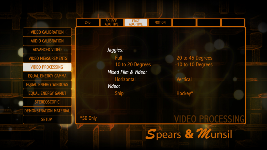
Jaggies
This clip is encoded as interlaced video, so it must be processed by a deinterlacer in video mode. The best deinterlacers can interpolate single fields of video with edge-adaptive algorithms that smooth out diagonal edges and make them look reasonable. This pattern allows you to see how good that processing is.
The bar that is rotating back and forth should have smooth edges with no stairsteps or jaggies. The section of it near the end that is passing over a series of horizontal lines should have minimal artifacts, and the artifacts should be near the end of the bar, symmetrical, and not extending several scan lines in either direction.
There are colored markers for each of three different angle ranges:
• The red marker is for the 20-45 degree range, which is the easiest to detect and smooth. If these angles are not smooth it suggests that there is no edge-sensitive interpolation being performed.
• The yellow marker is for the 10-20 degree range, which is harder. Some deinterlacers either fail to effectively smooth these angles or add visually distracting artifacts.
• The green marker is for the -10-10 degree range, which is the hardest. Many deinterlacers either fail to effectively smooth these angles or add visually distracting artifacts.
Mixed Film and Video
This clip has film-sourced background with text overlaid on it that is changing every field.
The deinterlacer should recognize that this is video and switch to video mode, but the text should still be reasonably clean and readable. At no point should you see combing on the text.
Ship
This clip is designed to evaluate the player or display’s ability to deinterlace true video content without distracting jagged stairstep patterns on edges. Look at the thin ropes that crisscross the ship, especially the ones that are close to horizontal, and the yellow trim on the side of the ship. They should be smooth and solid looking, not jagged, stairstepped, or broken into small segments.
Hockey
This clip is designed to evaluate the player or display’s ability to deinterlace true video content without distracting jagged stairstep patterns on edges. Look at the diagonal edges of the top of the glass in the foreground, and the lines on the ice, and the edge of the rink in the background. They should be smooth and not jagged or stairstepped.
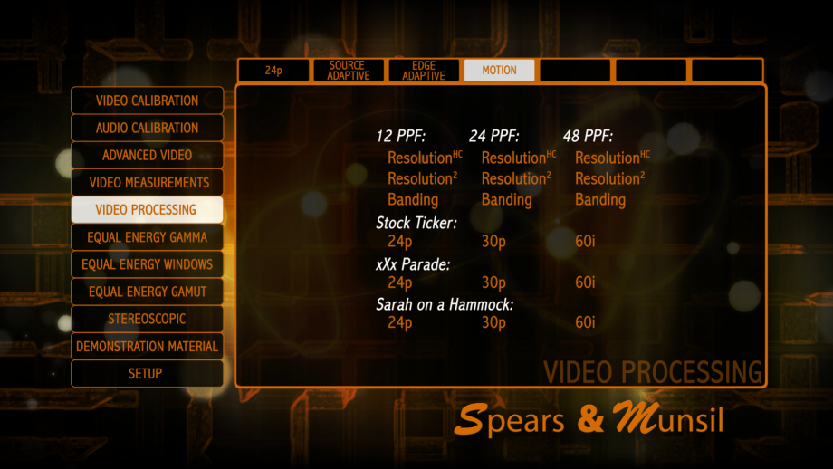
Motion Resolution
This clip allows you to see how well you can resolve detail in moving images on your display.
Some display technologies are inherently better at dealing with motion, such as CRT and Plasma, and some are inherently not as good, like LCD and LCOS. It’s common for displays that are not as good at motion representation to add interpolation technology to generate 120 or 240 frames per second and improve the resolution.
These patterns have a small burst that moves back and forth in a sinusoidal pattern, with a maximum speed of 12, 24, or 48 pixels per frame (PPF).
You should see the burst clearly at the endpoints, when it stops and changes direction, but depending on the display technology you are viewing with and the interpolation mode you are using, you may find that the burst remains clearly viewable all along its travel or that it turns blurry somewhere along the path. If you change interpolation modes, you can see how it affects the point in the movement that the burst turns blurry.
Motion Banding
This clip allows you to see whether your display introduces dynamic range quantization when objects are in motion.
Quantization shows up as visible bands along gradients that look smooth when the object is stationary. This artifact has been noted most with certain LCOS projectors.
These patterns have a small gradient color patch that moves back and forth in a sinusoidal pattern, with a maximum speed of 12, 24, or 48 pixels per frame (PPF).
The patch should look smooth at the endpoints, when it stops and changes direction, but depending on the display technology you are viewing with, you may find that the patch develops visible bands at some point along its path.
Stock Ticker
This clip combines a variety of scrolling lines of text similar to a stock ticker or the scrolling news feed at the bottom of the screen on many cable news and business channels.
Some display technologies are inherently better at dealing with motion, such as CRT and Plasma, and some are inherently not as good, like LCD and LCOS. It’s common for displays that are not as good at motion representation to add interpolation technology to generate 120 or 240 frames per second and improve the resolution. This clip allows you to check the readability of moving text at different sizes and speeds, and see how that is affected by changing interpolation modes (assuming your display offers them). This also is a revealing test for judder, frame dropping, and other motion anomalies. The text should move smoothly with no jumping, tugging, or shuddering.
xXx Parade
This clip combines small scrolling video clips moving at different positions along the screen.
Some display technologies are inherently better at dealing with motion, such as CRT and Plasma, and some are inherently not as good, like LCD and LCOS. It’s common for displays that are not as good at motion representation to add interpolation technology to generate 120 or 240 frames per second and improve the resolution. This clip allows you to check the clarity of the different small clips, and see how that is affected by changing interpolation modes (assuming your display offers them). This also is a revealing test for judder, frame dropping, and other motion anomalies. The clips should move smoothly with no jumping, tugging, or shuddering.
Sarah on a Hammock
This clip is a live-action clip of a person swinging in a net hammock.
Some display technologies are inherently better at dealing with motion, such as CRT and Plasma, and some are inherently not as good, like LCD and LCOS. It’s common for displays that are not as good at motion representation to add interpolation technology to generate 120 or 240 frames per second and improve the resolution. This clip allows you to check for blurriness of the fine ropes of the hammock when they are moving. Compare to when they are motionless at the end of the hammock’s swing, where they should be sharp and clear. See how the motion blur is affected by changing interpolation modes (assuming your display offers them).
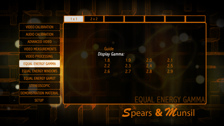
Equal Energy Gamma
This section of the disc contains patterns for checking the average gamma of your display without the need for test equipment like a digital light meter or spectroradiometer. These tests are not as precise as the gamma checks that a professional calibrator can perform by measuring the light output of the display using the calibrated window patterns on this disc, but it can help you choose an appropriate gamma mode, especially when the gamma settings are labeled with fanciful but unhelpful terms like “vivid,” “natural,” and “daylight.”
The gamma of the monitors used for doing precision video mastering work is generally close to 2.4 or perhaps a little lower, and for most purposes that is the gamma we suggest setting your display to. If you watch video in a bright environment, you may want to choose a lower gamma to make the midtones on screen brighter to help fight washout from ambient room light. In a dedicated theater room, however, we suggest trying to hit a gamma of between 2.3 and 2.4.
The gamma patterns require that the display be unscaled in order to work. Since the patterns are encoded at 1920×1080, this means that they will only work on a display with exactly 1920×1080 resolution, and only if the display does not apply any overscan or other scaling to the image. If you see any moiré or bands in the checkerboard areas on these patterns, the display is applying scaling and the pattern should not be used to check gamma.
Certain displays are not able to display the small checkerboards at full amplitude, and will read significantly too low. Known displays that do not work well with this pattern include DILA and LCOS projectors. For these projectors, the only reliable way to check gamma is with a light meter or spectroradiometer.
As with all other patterns on this disc, help text is available by pushing the Up button on your Blu-ray Disc player remote.
These patterns are for checking the effective gamma of the midtones on your display without requiring a light meter or colorimeter.
This is only a single data point; measuring the complete curve requires using a meter and the Equal Energy Window patterns.
First, ensure that your display is not scaled. If scaling is being applied, you will see streaks, bands and/or moiré in the four fine-grained patterns arranged around the center square. If the display is being scaled, do not try to measure the gamma with this pattern; it will not be accurate.
Most LCOS projectors and plasma panels cannot display fine-grained patterns like the ones used in this pattern accurately. For those displays, a the Equal Energy Windows and a meter must be used for correct results. Assuming this pattern is appropriate for your display and no scaling is being applied, use the left and right arrows on your remote to move forward and backward between the patterns until you find the one where the fine-grained lines and checkerboards appear to have the same brightness as the center square. The number visible on screen near the corner of the center square gives the gamma. You may find it easier on a front projector if you deliberately defocus your lens until the fine patterns turn into a blur (just for this check).
If you are using this to choose a gamma setting or mode, the recommended gamma for a display in a dark room is 2.4, but if you are watching in a bright room you may want to use a lower gamma, which will brighten the midtones without clipping the peaks or brightening black.
The 2×2 patterns use coarser checkerboards and lines, and may work better for some displays, but are somewhat harder to read.
Equal Energy Windows
These patterns are designed for measuring with a colorimeter, light meter, or spectroradiometer as part of a gray scale calibration by a trained calibrator. They are designed so the total amount of light being produced by the display is unchanged from pattern to pattern. As the level in the center changes, the concentric bands around the edge change to compensate, keeping the overall light output and power draw constant even on notoriously tricky displays like plasma panels.
These patterns use our own dithering that improves the accuracy of the windows as read by a meter. If they measure slightly differently than the windows on other discs, that is by design. Most pattern generators and calibration discs round their window values to the nearest 8-bit value, but these give better than 11 bit accuracy.
As with all other patterns on this disc, help text is available by pushing the Up button on your Blu-ray Disc player remote.
These patterns are useful for measuring gamma and gray-scale tracking, among other things.
Because each pattern has an equal number of pixels at each level, it gives correct results on displays with difficulties maintaining bright windows without dimming, like plasma panels or projectors with an automatic iris. The alignment pattern just has an aiming reticle to make it easier to aim a colorimeter, light meter, or spectroradiometer.
The rest of the patterns are just windows from 0% to 100%, with the concentric rectangles around the edge calibrated to make all of them produce equal light energy. The quick access section is just an easy way to jump to the two most popular levels for measurement: 30% and 80%.
Equal Energy Gamut
These patterns are designed for measuring with a colorimeter or spectroradiometer as part of a color gamut calibration by a trained calibrator. They are designed so the total amount of light being produced by the display in all color channels is unchanged from pattern to pattern. As the level in the center changes, the concentric bands around the edge change to compensate, keeping the overall light output and power draw constant for each color channel even on notoriously tricky displays like plasma panels.
These patterns use our own dithering that improves the accuracy of the windows as read by a meter. If they measure slightly differently than the windows on other discs, that is by design. Most pattern generators and calibration discs round their window values to the nearest 8-bit value, but these give better than 11 bit accuracy.
As with all other patterns on this disc, help text is available by pushing the Up button on your Blu-ray Disc player remote.
These patterns are useful for measuring color gamut and adjusting color management systems, among other things.
Because each pattern has an equal number of pixels of each color, it gives correct results on displays with difficulties maintaining bright windows without dimming, like plasma panels or projectors with an automatic iris. The alignment pattern just has an aiming reticle to make it easier to aim a colorimeter or spectroradiometer.
The rest of the patterns are just windows in each primary color with the concentric rectangles around the edge calibrated to make all of them produce equal light energy in each channel.
Stereoscopic
These patterns are designed to adjust and check various aspects of stereoscopic (or “3D”) image display. Using these patterns you can:
• Check that the stereo polarity is correct – that the left eye is seeing the left eye view and the right eye is seeing the right eye view.
• That you are seeing proper stereo across the entire display when viewing the screen from each seating position.
• That the display is capable of presenting properly discernible depth.
• That the left and right eye images are properly aligned with each other.
In addition, note that nearly all of the patterns on the rest of the disc can be viewed in stereoscopic mode by changing to “3D” mode in the Settings menu. In that mode, the disc will change your display to stereoscopic mode so you can make sure that all the settings are correct while the display is in 3D mode as well as 2D mode. Also note that the Montage video in the Demonstration Material section is a stereoscopic video and is an excellent demonstration of the 3D capabilities of your monitor.
These patterns can only be viewed if you have a 3D Blu-ray Disc player and a 3D display and the appropriate glasses necessary for your display. Most of the time, if you have a 3D display and player, the 3D mode should turn on automatically, but in some cases you may need to enable 3D mode in your player or display’s menus and/or charge up your glasses before you can view 3D content.
As with all other patterns on this disc, help text is available by pushing the Up button on your Blu-ray Disc player remote.
Polarity Check
This pattern allows you to check that you are seeing the correct image in each eye.
To view this pattern, you must have a 3D Blu-ray Disc player and a 3D TV, and any components between them in the chain such as a receiver or video processor must be 3D-aware and HDMI 1.4 compatible.
Usually selecting this pattern will put your television into 3D mode, but if it doesn’t you may need to check the components to make sure everything is 3D-compatible, and that your display is set to automatically switch 3D modes. The pattern has crosshatches that are positioned behind the screen, at the screen, and in front of the screen. If the crosshatches that are supposed to be in front of the screen are behind the screen and vice-versa, you will need to check for a polarity switch on your glasses or in the menus of your display, player, or processor.
Positioning
This pattern is designed to be used with passive displays using micropolarizing screens.
These screens are typically sensitive to the angle you view them, and at certain angles you get excessive ghosting or even a complete loss of 3D effect. By adjusting the tilt or position of the screen, or your seating position, you can make sure that you are getting the best 3D effect all the way across the screen.
This pattern has three grids at different angles, with one in front of the screen, one at the screen, and one behind the screen.
Sit in your regular viewing location and scan across the screen to make sure you are seeing proper depth at all four corners and the center. Check for ghosting in all parts of the screen. If one or more corners have problems, move your head around to see if another position works better. If so, you will want to adjust the screen position or tilt, or your seating position, or both.
Depth Steps Positive
This pattern has multiple steps at different depths going in the positive direction, or away from the viewer.
Each step should be clearly visible and different from the step before it or after it. On a screen with inadequate resolution you may find that some steps appear to be at the same level.
Depth Steps Negative
This pattern has multiple steps at different depths going in the negative direction, or toward the viewer and out of the screen. Each step should be clearly visible and different from the step before it or after it. On a screen with inadequate resolution you may find that some steps appear to be at the same level.
Alignment
This pattern is provided for aligning stereoscopic display systems that use two projectors. (Note that most 3D TVs do not require any kind of 3D alignment.)
In general, if your projectors have physical lens shift you will want to use that to align the images. Simply aim them both in the same direction, then use lens shift and zoom on the two projectors to get the two alignment patterns overlaid on each other. If your projectors do not have physical lens shift, you will need to use a combination of opposite digital keystone adjustment and physically changing the projectors’ aiming points.
Start by pointing the projectors and adjusting zoom so their top and bottom edges align, but the left and right edges are at different angles. Then adjust the two projectors’ digital keystone in opposite directions until the left and right edges are parallel. Go back to aiming and changing zoom to get the all four edges aligned. You may need to go back and forth between adjusting keystone and reaiming and zooming. Your goal is to get the two images as close to overlaid as possible. Without lens shift, you may need to settle for a “close enough” match. In such cases, try to spread the error across the whole screen rather than concentrating it all at the top or bottom, so that at any point on the screen you have the minimum error you can achieve.
Eye Sync
This pattern is for checking if the left and right eye views are being presented to your eyes at the same time. Many technologies, including shutter glasses, cannot truly show two images simultaneously, and instead present the left and right views by alternating back and forth between them quickly. This introduces a delay between the two eye views, which results in small depth errors when objects are moving left to right or vice-versa. Depending on which eye is presented first, you may see objects moving in one direction pop out of the screen or move into the screen. Whichever it is, objects going the other direction will do the opposite.
To use this pattern, view it in 3D mode while wearing your glasses (if needed) and note which of the nine moving sets of lines seems closest to “flat,” where the two seem to be moving straight left and right, and not moving into and out of the screen in a circle or oval. The number in the frame around that pattern gives the effective delay between the left and right eye views. If none of them appears completely flat, the actual delay is somewhere in between the two that are the most flat. Note that this pattern must be in motion to work. When the pattern is paused it looks the same on all displays.
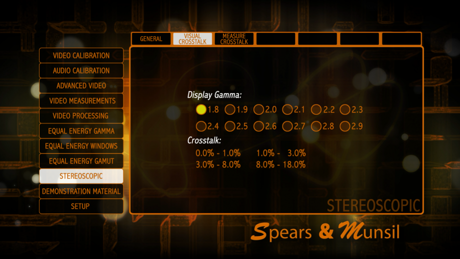
Visual Crosstalk
These patterns are for measuring the amount of crosstalk, which is the amount of the left eye image that is visible with your right eye and vice versa.
Stereoscopic imaging relies on viewing separate left and right images with your left and right eye, so any leakage is bad. When the two images leak into the opposite eye, it produces an effect called “ghosting” where you see a ghostly version of objects just to the left or right of them, with the effect reversed in each eye. It can show up as just general blurriness of objects, and is usually worst with objects that are far away from the screen either in front or in back.
To measure absolute crosstalk, you will need to select the gamma of your display, and more specifically the gamma near black. If you know your gamma, then select the closest match from the list. If you don’t know, select 2.4, but be aware that you can’t rely on the numbers you find being comparable to numbers from other displays.
To check the crosstalk, bring up the 0.0-1.0% pattern, put on the 3D glasses that came with your display, and cover your right eye. With your left eye, look at the patterns on the left side of the screen (where the center band in each section is darkest). Find the numbered patch in each color that matches the center band most closely. If the center band is brighter than any patch on screen, push the right arrow on the Blu-ray Disc player remote to go to the 1.0%-3.0% pattern and continue. If the center band is still too bright, select a brighter pattern and so forth. Switch eyes and do the same thing with your right eye and the patterns on the right side of the screen.
Assuming your gamma is accurate, the percentage you find is the absolute percentage of light from the right eye view that is leaking into the left eye. You can assume that a similar amount is leaking the other way from the left eye view to the right eye.
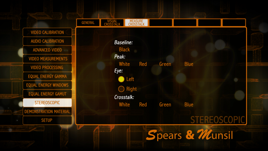
Measure Crosstalk
These patterns are useful for measuring the amount of crosstalk using a light meter.
You will need a very good, sensitive light meter like the Minolta LS-100, or a similar unit that can measure very low light levels.
You will need to aim the light meter at the center of the screen, and rig up something to hold one side of the 3D glasses over the meter. Verify that the meter can see clearly through the glasses and that the glasses are charged and working. You can pick either side, or measure both sides to see if they match. Put up the Peak pattern for aiming purposes to make sure the white fills the light meter viewfinder.
You need three measurements: black level, white level, and crosstalk level, all of them measured through the same side of the glasses. Black level is just the residual light making it through the glasses with a completely black screen showing for both eyes. White level is the light through the glasses with both eyes seeing a simple white window. Crosstalk level is the light level coming through when there is a white square showing in the unmeasured eye and a black screen in the measured eye.
The equation to figure crosstalk, with B, W, and C being Black level, White level, and Crosstalk level, respectively, is (C – B) / (W – B). To convert to a percentage, multiply by 100. We have an Excel file available on our web site that will perform this calculation. You can also measure crosstalk for just one channel by applying the same technique with a red, green, or blue field. Black level remains the same for any of the four measurements.
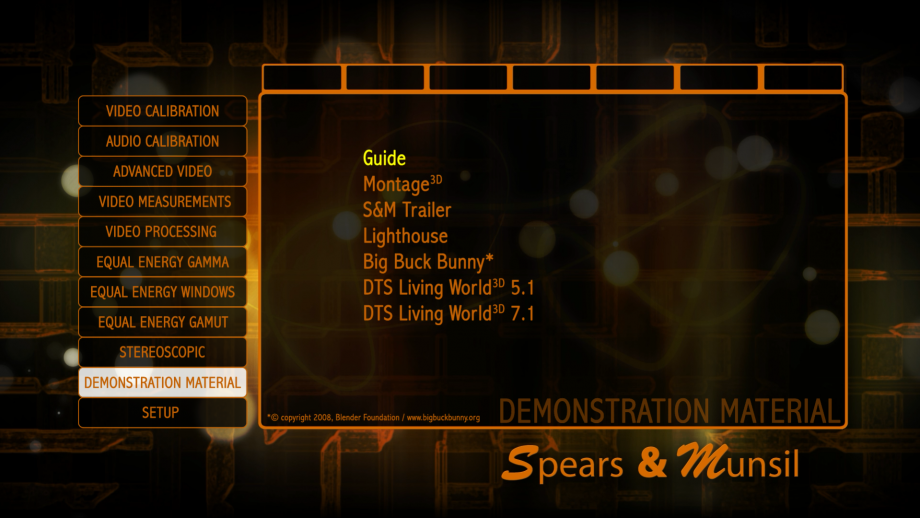
Demonstration Material
This section contains high-quality video material you can use to demonstrate the video and audio capabilities of your system, and is very useful for evaluating equipment when shopping for new players and displays. All the content was generated using the very highest bitrates and best available compression and mastering, and is absolutely the state of the art. The video was processed from the original masters using exclusive software developed by Spears and Munsil that uses radiometrically linear light processing in floating point precision to do all scaling and color conversion. The patented dithering techniques produce the equivalent of 11+ bits of dynamic range in all color channels.
Some notes on the individual clips:
• Montage: All video was shot and edited by Stacey Spears using dual RED EPIC cameras at 5K resolution. Music by Johnny Bregar.
• Lighthouse: All video was shot and edited by Stacey Spears using the RED ONE camera at 4K resolution. Music by Johnny Bregar.
• DTS Living World: Video courtesy of DTS, Inc.
• S&M Trailer: Video created by Brian Florian.
• Big Buck Bunny: Video copyright 2008 Blender Foundation. http://www.bigbuckbunny.org
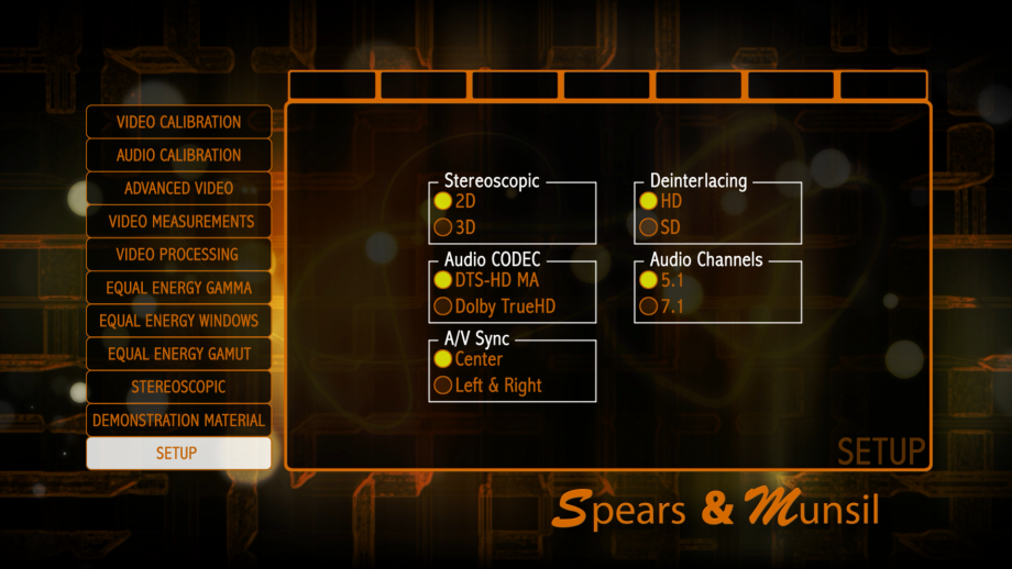
Setup (Settings)
This section allows you to change global settings that affect patterns in other menus.
Stereoscopic
Allows you to force the video patterns to display in 3D mode. They will not have depth (other than the patterns in the Stereoscopic section of the disc) but will allow you to calibrate and adjust settings with the display in 3D mode. Many displays have completely different memories and settings for 3D mode, so it is worthwhile to run a complete set of calibrations while in 3D mode as well as 2D mode.
Deinterlacing
This allows you to select whether the deinterlacing clips will display in HD resolution (1080i) or SD resolution (480i). The deinterlacing clips are in the Video Processing section under the Source Adaptive and Edge Adaptive submenus.
Audio Codec
This allows you to select the audio compression used for the audio calibration patterns.
Audio Channels
This allows you to select whether the audio calibration patterns will have 5 main channels or 7 main channels (plus a subwoofer in both cases). You should choose the setting that matches your actual speaker layout.