Introduction
Using the tests on the Spears and Munsil High Definition Benchmark to adjust your display is not difficult and performing the basic calibration should take 30 minutes or less. It’s important to be methodical and careful while performing the adjustments, and to understand what to look for in each test. Before beginning you may want to review the detailed background articles about the basic adjustments found on the Spears and Munsil web site. Reading these is not required to get a good picture, but it’s helpful for understanding the theory behind each test pattern.
Preparation
Perform the calibration under the same lighting conditions you generally use to watch quality material like movies. In general, video looks best when the room is as dark as possible, but it’s most important to duplicate the real lighting conditions you will be watching under. If there are windows in the room that let in sunlight and you tend to watch movies at night, then the calibration should also be performed at night. If your display has multiple picture memories and you watch the display under multiple lighting conditions, it may be worthwhile to perform the calibration separately for each of the lighting conditions and assign each one to a different picture memory.
When you’re ready to perform the calibration, first turn on your display and Blu-ray player and let the system warm up for 15 minutes or so, preferably playing some real material. The demo footage on the Spears and Munsil disc is a good choice, but most movies work fine as well.
While it’s warming up, gather the following materials:
• Pen and paper
• The Spears and Munsil disc (if it’s not already in the player), and the booklet
• The original remote for the Blu-ray player (we recommend not using a universal remote, as you may need to access special functions that are only available on the original remote)
• The original remote for the display (again, preferably not a universal remote)
• If the video passes through any receivers, switchers, or video processors, you’ll want the original remotes for those.
• The owner’s manuals for the player and display, and any receivers or processors that the video signal passes through.
• If you’re calibrating in the dark, you’ll want a small flashlight or headlamp to make it easier to see the remotes, paper, booklet, etc.
During the calibration, your primary location should be your normal seating location while watching movies. If possible, that location should be centered, i.e. facing the screen directly rather than at an angle, but if that’s not practical use your actual movie-watching location; don’t calibrate from the center unless that’s where you normally sit.
Take some time to familiarize yourself with the display remote. You can do this while the system is warming up; it won’t cause any harm to bring up menus and so forth during the warm-up time. Make sure you know how to bring up the video settings menus and reach the Brightness, Contrast, Color, Tint, and Sharpness controls. Consult the owner’s manual if needed. It is a good idea to write down at this point the current video setting values so if needed you can reset everything and start over. Write down every menu item, not just the five main ones mentioned above. If the display doesn’t give exact numbers for each setting, just write down their visual position as best you can, like “far left” or “dead center” or “two notches below far right.”
Focus
If your display is a front projector (an independent projector that projects onto a separate screen, as opposed to an integrated “rear projector” where the screen and projector are all in the same box), you will want to check the focus, as small focus errors can mask issues and artifacts. Flat-panel displays like LCD or plasma do not have focus. Integrated rear projectors can only be focused by a trained technician.
Use your Blu-ray remote to select the Chroma Alignment pattern. Look at the five small crosshairs in the center of the screen and the four corners, and adjust the focus until the lines are as sharp and clear as possible. If your projector has motorized focus, stand close enough to the screen to see the individual pixels and use the remote to focus until the pixels are sharply defined squares. If you must stand at the projector to adjust focus, we recommend using binoculars to view the screen at high magnification while you turn the focus dial.
A few extra tips about focus:
• When the projector is completely focused, if the spaces between the pixels are distracting, as though the image looks like it’s being viewed through a window screen, it may be worthwhile to defocus the lens a tiny amount to spread the pixels slightly. Defocus only enough to reduce the gaps between the pixels; do not defocus until the pixels overlap each other.
• If it is impossible to get the entire screen in sharp focus, try to find a happy medium where each of the five crosshairs is roughly the same level of blurriness. If it is impossible to get all the crosshairs acceptably sharp, you may want to check the flatness of your screen, whether your projector is pointed perfectly centered and perpendicular to the screen, and whether the lens has any smudges or dirt on it.
Video mode settings
Once the system has warmed up, it’s time to start adjusting. Most modern displays have an overall “Picture Mode” setting, and several advanced picture settings. It’s important to get these set correctly first.
Picture Mode
There are no standards for what these modes do, and the names vary considerably. Generally if there is a “Movie” or “Cinema” setting, that is the one to use. On some displays, the “Movie” or “Cinema” mode is preset and locks out all the other picture controls. In that case, or if there is no “Movie” or “Cinema” mode, try using “Custom,” “Normal” or “Standard.” Avoid anything that sound like it makes the picture extra-bold, like “Vivid” or “Dynamic”, or modes that sound like they’re optimized for a single purpose like “Sports” or “Game”.
Advanced Video Modes
For the most part, we recommend turning special picture “enhancement” modes off. They are usually optimized for low-quality video and bright environments, and actually will harm the picture quality of high-quality video like Blu-ray Discs when watching in a low-light environment.
Set these to Off or 0 (write down the original setting first):
• Noise Reduction/Noise Filter
• Black Tone
• Dynamic Contrast
• Shadow Detail
• Flesh Tone
• Edge Enhancement
• Black Corrector
• Contrast Enhancer
• Live Color
• Smart Dimming
• Color Enhancement
• Ambient Light Sensor
• Motion Plus/Cinema Motion/Smooth Motion/Real Cinema
• Auto Iris
If you encounter a mode with a similar name to one of the above settings, or a mode that is described in the owner’s manual as a video enhancement or improvement, it’s best to turn it off.
If you are curious to see what some of these modes do, our recommendation is to wait until the calibration and adjustment is done, then try them systematically, one at a time. Turn one on, run through the test patterns and view some video to see the results, make notes if needed, then turn it off again and move to the next. Some of them will throw off the adjustments you’ve made, and you’ll see that clearly on the test patterns. Some won’t appear to do anything obvious, which in our view means leaving it off is the safest bet.
Special cases:
• Color Temperature/Color Tone. Setting this perfectly requires test equipment, but usually if there is a “Cinema”, or “Neutral” option, that is often close to correct and is a good choice. If that is not offered, “Computer” or “Normal” are other good choices. “Cool” is not generally a good choice, as commonly it sacrifices color accuracy to get higher light output. It is worthwhile putting up the 11-Step Crossed Gray Scale pattern and trying the different color temperature settings. Any setting that makes any of the gray steps seem to have a colored tint are probably bad choices. It’s not uncommon to have more than one setting that looks essentially white. Unless you have the test equipment necessary to check color temperature, just select one that looks as neutral as possible.
• Backlight. If this setting is offered, a good starting point is to turn it to the middle value. Later on, when you are performing the rough Contrast adjustment (further down in this guide), if the screen seems uncomfortably bright when viewing the Contrast pattern on the Spears and Munsil High Definition Benchmark, turn the backlight down until the light output is comfortable to view. Then when you are performing the Brightness adjustment (further down in this guide), if the screen seems notably dim while viewing the PLUGE Low pattern, such that the right-hand bars on the PLUGE Low pattern are very hard to see once the Brightness control is set correctly, then turn the backlight up.
• Black Level or HDMI Black Level. This should be set to “Low”, “Video”, or “Standard”. It should not be set to “Normal”, “PC”, or “Extended”.
Setting display area
To properly set this, you’ll want to bring up the Image Cropping pattern, using your Blu-ray player remote. The goal is to see as much of the picture area as possible with no cropping or distortion.
Each of the boxes along the top and bottom should be the same width, and the boxes along the left and right edges should be the same height. If they are not all the same, some kind of non-linear zoom is being applied; look for a “zoom”, “wide mode” or “aspect” button on the remote or setting in the video menu, and try modes until the boxes are all the same width and the maximum amount of image is visible. As a cross-check, bring up the Geometry pattern and make sure that the squares look square and not rectangular and the circles look circular and not oval, across the entire screen.
On the Image Cropping pattern, the edges of each box should be fully visible. If some of the boxes are cut off by the edge of the screen, the display has overscan, and it’s a good idea to turn it off. Look in the menus for a “Screen Size” or “Display Area” or “Overscan” setting. Change that setting to “Full Size”, or “No Overscan” or try the various modes and controls to try to show the entire image.
The ultimate goal is to get the pixels in the disc image mapped to the pixels on your screen 1:1, so there is no digital scaling going on. To check for scaling, look at the single-pixel and two-pixel checkerboards in the center of the Image Cropping pattern. When there is no scaling being performed, they should look evenly gray, and should essentially match the gray level of the rest of the screen background. When the image is being scaled up or down, the checkerboards will have blotchy patches of dark and light, and the size of the tiny squares will vary. If you find that it is impossible to get both all the pixels on the edges visible and achieve 1:1 mapping of the pixels in the checkerboards, it is better to get the 1:1 mapping than it is to show the entire image. Small amounts of cropping on the edges will be less problematic overall than digital scaling of the image.
On some displays it will be impossible to eliminate the overscan and show the entire cropping pattern. In such cases, select the mode that shows as much of the image as possible without distortion. If the display has picture position controls, you should use them if needed to center the image on screen by moving the picture up, down, left, or right until the amount of cropping on the left matches the amount on the right, and the amount on the top matches the amount on the bottom.
Performing the basic video adjustments
The basic adjustments should be done in the following order:
• Initial contrast (Contrast pattern and Clipping pattern)
• Brightness (PLUGE Low and PLUGE High patterns)
• Color (Color Bars pattern)
• Tint (Color Bars pattern)
• Recheck contrast (Contrast pattern and Clipping pattern)
• Sharpness (Sharpness pattern)
Remember that help for each pattern is available by pushing the up-arrow button (or pushing up on the directional pad) on your Blu-ray remote while the pattern is displayed on the screen. The help text gives you the basic instructions for that pattern and shows what the pattern will look like when the control is adjusted correctly or incorrectly.
Initial contrast
It’s a good idea to start by setting the contrast to a reasonable value that doesn’t clip the highlights. This ensures that other patterns and adjustments will be accurate and not thrown off by clipping.
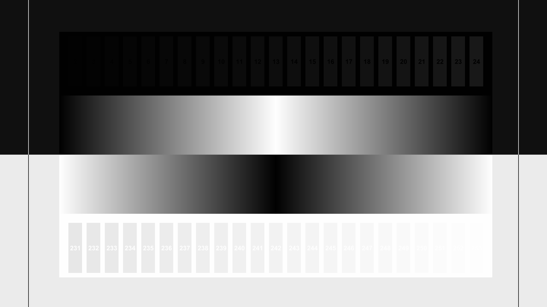
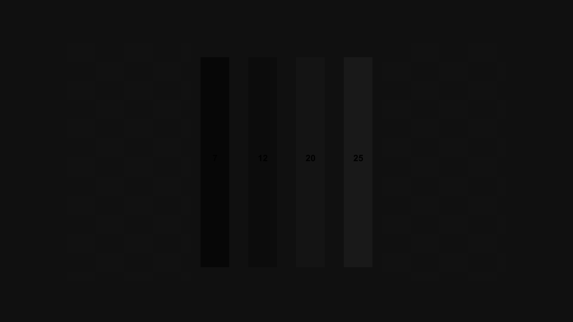
Start by bringing up the Contrast pattern using the Blu-ray remote. Bring up the display’s Contrast control (labeled “Picture” control on some displays) using the display remote. If you haven’t already written down your current Contrast control setting, write it down now. Try raising the contrast control all the way to its highest setting. You will probably see many of the on-screen white bars blend into the background and disappear. You may also see a subtle color shift in the white background. Now reduce the contrast control until the highest bar is just barely visible. If you can’t make the highest bar visible no matter how low the contrast goes, lower the bar until as many bars as possible appear. Now find the highest-numbered bar, and raise the Contrast control until that bar disappears, then lower it one notch, which should make it appear again. If not, lower slowly, a notch at a time, until that bar becomes barely visible.
Now bring up the Clipping pattern. There are eight squares here, two each of white, red, green, and blue. Each one should look like concentric squares of increasing or decreasing brightness. Check the image on the help screen for a reference (push “up” on your Blu-ray remote). If all of the colors look like concentric squares and not a solid square, then you’re done and can move on. If one or more of the colors are clipped, try reducing the Contrast control and see if the concentric squares appear. As with the Contrast pattern, the object is to turn Contrast down to the highest setting that shows as many of the concentric squares as possible. If reducing the Contrast control doesn’t reveal any new concentric squares, then return it to the value you found using the Contrast pattern.
For more information, please read our article Setting the Contrast Control.
Brightness
Now you are ready to set the Brightness control. Bring up the PLUGE Low pattern using the Blu-ray remote, then bring up the Brightness control using the display remote. If you haven’t already written down the current Brightness control setting, do so now.
Try raising the Brightness control all the way and then lowering it all the way and watch what happens to the pattern. With the Brightness control at maximum, on most displays you will see four vertical bars on screen and a checkerboard pattern in the background. With the Brightness control at minimum, on most displays you’ll see a completely black screen. If you never see the two leftmost bars no matter where the Brightness control is positioned, then your display or player is clipping the below-reference image data; use the Alternate Brightness Adjustment mentioned lower down.
Standard Brightness Adjustment
Turn the Brightness control up until all four bars are visible on screen. Then turn it down until the two leftmost bars disappear and the two rightmost bars are visible. The far-right bar will be slightly easier to see than the middle-right bar. If there are several settings of Brightness that make the left bars invisible and the right bars visible, you may be able to get a more precise setting by looking for the setting that makes the background checkerboard just barely visible.
Alternate Brightness Adjustment (when you can’t see the left bars)
Turn the Brightness control up until the two right bars are clearly visible. Turn the Brightness control down until the middle-right bar disappears, but the far-right bar is visible. Now turn the Brightness control back up slowly until the middle-right bar just barely appears.
For more information, please read our article Setting the Brightness Control.
Color
For this adjustment you’ll need a colored filter or a display with a blue-only mode. Most displays do not have a blue-only mode, but it’s worth checking the advanced settings menus and/or the owner’s manual to see, because usually the blue-only mode is easier and more accurate than using the filter. If your display does not have a blue-only mode, then the Spears and Munsil blue filter is the best bet as it allows the user to select 1X, 2X, or 3X strength to help get an accurate calibration with different displays with different color spectra. Other blue filters from other companies like THX, Joe Kane, or Disney may also work, but be sure to check if they are completely cancelling the green channel before using them.
Checking the Filter Strength
The colored filter works by showing you the blue color channel only, filtering out all the green and red. Typically any filter will remove enough red to be usable, but the color spectrum of the green channel and the blue channels overlap on nearly all displays, so it’s necessary to first check that the green channel is being cancelled before using the filter.
First bring up the Color Bars pattern and look through the 1X side of the filter. Look at the large green color bar and compare it to the black space below it (move the filter aside temporarily as needed to identify the green bar). Through the filter, both should look absolutely black. If the green bar is at all brighter than the black space beneath it, then switch to the 2X side of the filter. If the green bar is still brighter than the background, then you’ll need to fold the filter in half to make a 3X filter. The 3X filter is nearly opaque, and to use it you may need to make the room completely dark or nearly so. This is the exception to the rule about calibrating in the same light you normally watch movies in; for this adjustment, if you need to make the room dark to make the filter work, do so.
For more information, please read our article Using the Spears & Munsil Calibration Filter.
Setting the Color control
Once you know what strength of filter to use, bring up the Color control with your display remote. If you haven’t already written down the current Color control setting, do so now. Look through the filter and watch the large blue bar and the white bar below it (and/or the large white bar with the small blue bar beneath it) as you move the Color control up and down. Again, you may need to move the filter aside temporarily to identify the blue and white bars, since through the filter everything looks blue. You’ll see the relative brightness of the blue and white bars vary. Moving the control one way will make the blue bar brighter, and the other way will make it dimmer. Adjust the Color control until the blue and white bars are as close in brightness as you can make them (when viewed through the filter).
Tint
Setting the Tint control uses the same pattern and the same filter strength you already worked out for the Color control, above.
Bring up the Tint control using your display remote. If you haven’t already written down the current setting, do so now.
Look at the magenta and cyan bars on the pattern directly, without the filter. The large magenta bar has a small cyan bar beneath it, and the large cyan bar has a small magenta bar beneath it. The object is to set the Tint control so that the magenta and cyan bars have the same brightness when viewed through the filter. Look at those bars through the filter and move the Tint control up and down to see how the brightness of the bars varies. Then adjust the control so that the bars are as close to the same brightness, when viewed through the filter, as you can make them.
Most displays come from the factory with the Tint control set correctly or very close to it, so don’t be surprised if you don’t need to change the control at all, or only need to change it a notch or so.
For more information, please read our article Setting Color and Tint.
Recheck Contrast
At this point it’s a good idea to redo the Contrast control adjustment, as changes made to the Brightness and/or Color controls may affect the appropriate Contrast setting. Follow the same instructions given above to check the Contrast and Clipping patterns to set the Contrast control to the highest level that doesn’t clip.
Sharpness
The Sharpness control is perceptual, and the goal is to turn it up as high as possible without adding artifacts to the image, so where it is set will depend on the visual acuity and sensitivity to artifacts of the user and where the user sits. There is no “perfect” setting that works for everyone and every viewing situation.
Bring up the Sharpness pattern using the Blu-ray remote, and then bring up the Sharpness control using the display remote. If you haven’t already written down the current Sharpness setting, do so now.
Try taking the sharpness control all the way up to see what happens. On most displays you’ll see white “halos” around the darker lines in the image, and sometimes even several concentric halos. You will also generally see that the diagonal and curved lines look stairstepped or jagged. (You may want to get up from your normal viewing position just to look carefully at the screen and see the halos and stairsteps, but then sit back in your normal viewing position to continue the adjustment.) You may also want to turn the Sharpness control all the way down and see what happens. On most displays, the lines will be smooth, with no jaggedness or halos, but the lines will not look crisp and sharp. You are trying to strike a balance between the crisp & sharp look and the artifacts like halos and jaggedness.
While sitting in your normal viewing position, turn down the Sharpness control until the halos are no longer clearly visible and the lines look smooth and not jagged. The lines should look crisp and sharp, but should not have extraneous artifacts, noise, or blockiness.
Finishing up
At this point, you have completed the core picture adjustments. It’s a good idea to run through the entire set of patterns, quickly, just to check that everything is still correct. Some displays may have interactions between the Brightness, Contrast, and Color controls (and even other controls like Sharpness), so it’s possible that you may need to make small tweaks to the controls on the second pass through them. Once you feel confident that the controls are all set properly, it’s a good idea to write down the calibrated settings along with notes about the date, equipment, and viewing conditions. Save these settings somewhere safe so you can quickly apply them if the display gets reset for any reason.
If you tend to watch under several viewing conditions, such as a brighter “day” environment versus a dark “night” environment, you may want to run a calibration in both conditions and compare the differences. Usually they will be similar, but you may find that Brightness needs to be turned up a few notches in a bright environment to compensate for the extra light falling on the screen. If your display has multiple picture memories, you can store the two calibrations in them and switch as needed. If your display does not have multiple picture memories, you can leave the calibration set for whichever environment you use the most, or the environment where you watch the most high-quality material, or split the difference between the two to get the smallest deviation from calibrated in both environments.
If you wanted to check the effects of some of the picture modes you turned off at the beginning of this process, now is a good time to do so. As mentioned earlier, try turning them on one at a time, and running through the test patterns and viewing the video montage (under “Demonstration Footage”) to see what the effect is on the image, if anything. Some of the modes will control settings that only come into play with standard definition content, or only affect moving images and not test patterns. As before, our general advice is to leave picture settings you don’t understand to “off.” Mostly you’ll find that high-quality video looks best with the minimum processing.
Now that you have performed the basic calibration, we recommend you read Choosing a Color Space to get the most out of your display. If you would like to know more about the patterns on our disc, we also recommend you read Technical Notes on the Patterns.
That’s it! Please let us know if you have comments or suggestions on the disc, the instructions, our web site or anything at all.